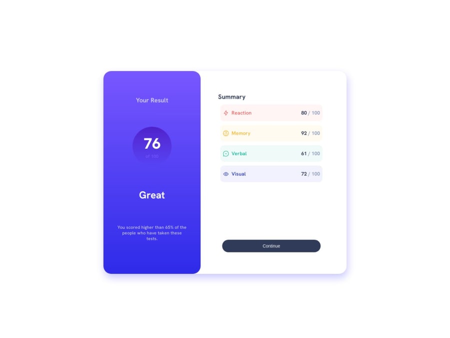
Design comparison
SolutionDesign
Solution retrospective
My solutions looks great on my end, and in the DevTools responsive test. But when i upload the solution the proportions look insane. COuld it be the way i set up my queries?
Community feedback
- @MelvinAguilarPosted over 1 year ago
Hello there 👋. Good job on completing the challenge !
- It seems like you might be repeating code in your media queries, you can create a media query for your responsive styles and adjust the specific properties that need to change based on the screen size.
- Encourage adopting a mobile-first approach to build responsive solutions more efficiently. Start by styling for smaller screens first and then use media queries to add styles for larger screens.
- Instead of using
position: absolutefor centering, consider using Flexbox. Wrap your component in a parent container and applydisplay: flex,justify-content: center,min-height: 100vh, andalign-items: centerto this parent. This will center your component both horizontally and vertically.
- Avoid using viewport width units like
width: 54vw;ormin-width: 27vw;for your components. If the screen is very wide, your component will also become too large. Instead, usewidth: 100%;and set amax-widthto restrict your component from growing beyond a certain width.
- Instead of setting a fixed height with vh, allow the height to be determined by the content within the summary-container. By removing the explicit height, the container will adapt to its content and avoid potential issues with proportions on different screen sizes.
I hope you find it useful! 😄
Happy coding!
2
Please log in to post a comment
Log in with GitHubJoin our Discord community
Join thousands of Frontend Mentor community members taking the challenges, sharing resources, helping each other, and chatting about all things front-end!
Join our Discord
