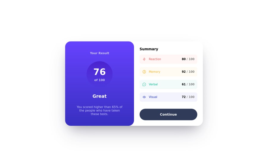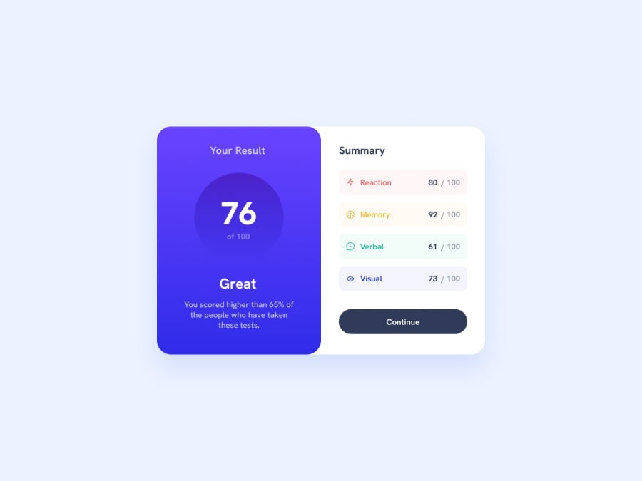
Design comparison
SolutionDesign
Solution retrospective
Build completed using new setup of neovim as my IDE. Tech under the hood is just react and standard BEM css.
I completed this build by going mobile first which is new for me. I think it went OK but I didnt love how it looked when in the desktop view.
What I am pleased about is how I was able to break the Summary section into subcomponents and pass props down do dynamically create the colored statistics.
Community feedback
Please log in to post a comment
Log in with GitHubJoin our Discord community
Join thousands of Frontend Mentor community members taking the challenges, sharing resources, helping each other, and chatting about all things front-end!
Join our Discord
