
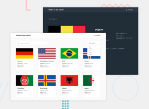
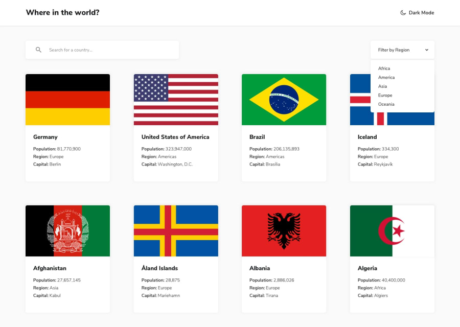
React REST Country API with color theme switcher fully responsive

Design comparison
Community feedback
- @michelNicePosted 9 months ago
hey there! how are you? I need your help.
I'm shrinking the logo image while scroll down on desktop, However I don't wanna not shrinking img when it goes to mobile, it has to stay the same while scrolling.
exemple what I am trying to do:https://www.nestpanos.com
my repository:https://github.com/michelNice/Nest-Panos
0@ar-mohantyPosted 9 months agoHi @michelNice,
I have gone through your question and let me try to explain you this effect with example using below code:
index.html code:-
<!DOCTYPE html> <html> <head> <meta name="viewport" content="width=device-width, initial-scale=1"> </head> <body> <div id="header">Header</div> <div style="margin-top:200px;padding:15px 15px 2500px;font-size:30px"> <p><b>This example demonstrates how to shrink a header when the user starts to scroll the page.</b></p> <p>Scroll down this frame to see the effect!</p> <p>Scroll to the top to remove the effect.</p> <p>Lorem ipsum dolor dummy text sit amet, consectetur adipiscing elit, sed do eiusmod tempor incididunt ut labore et dolore magna aliqua. Ut enim ad minim veniam, quis nostrud exercitation ullamco laboris nisi ut aliquip ex ea commodo consequat. Duis aute irure dolor in reprehenderit in voluptate velit esse cillum dolore eu fugiat nulla pariatur. Excepteur sint occaecat cupidatat non proident, sunt in culpa qui officia deserunt mollit anim id est laborum.</p> </div>50 || document.documentElement.scrollTop > 50) { document.getElementById("header").style.fontSize = "30px"; } else { document.getElementById("header").style.fontSize = "90px"; } }
</html>=> so as you see in the above code when scroll event happens in window object then window.onscroll event gets triggered and it calls a function called scrollFunction(); .
=> This function checks if body.scrollTop or documentElement.scrollTop is greater then some scroll amount like 50 in our case then the fontsize of header decreases and increases vice-versa. in your case instead of header you can use image and dynamically change its width from 90px to 30px as per your need.
=> hope this solution will be helpful to you. drop a comment if you got your solution.
0@michelNicePosted 9 months ago@ar-mohanty How are you today ?
I've been building a project however I do have some difficulties. well, one those problems is when I hover on the content with the IMG and the transform: scale effect doesn't work, What should I do?
Live project:https://lucent-chimera-a55018.netlify.app/
repository:https://github.com/michelNice/Nest-Panos
0

Please log in to post a comment
Log in with GitHub
Join our Discord community
Join thousands of Frontend Mentor community members taking the challenges, sharing resources, helping each other, and chatting about all things front-end!
Join our Discord