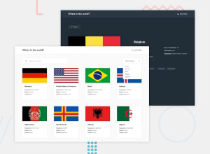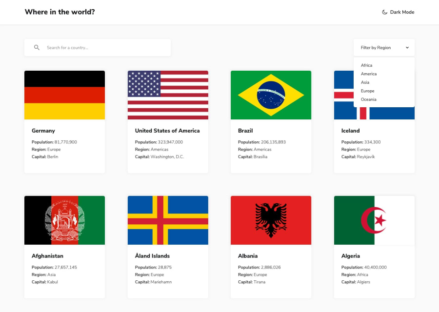
Design comparison
Community feedback
- @maakosu2Posted over 1 year ago
great work, good format, and the website are fast in the update, this content, however, I have some tips that may help you make your desktop view better, you can increase the number of items on each row to four from the two you have on your desktop view.
Marked as helpful0 - @Saad-HishamPosted over 1 year ago
great work✨ I believe that the project is almost perfect I have a small tip that may help you make it better since the API provides the population as just a number you need to format it with a comma after every number field To format the population numbers returned by the API with commas, we can use regular expressions. Here's an example of how to use regex to add commas to the population number:
// Convert the population number to a string and replace any non-numeric characters with the letter 's'

const value = country.population.toString().replace(/[^0-9]/g, 's');

// Add commas to the population number at every thousandth place
const formattedValue = value.replace(/\B(?=(\d{3})+(?!\d))/g, ',');
In the first line of code, we convert the population number to a string using toString() and then replace any non-numeric characters with the letter 's' using replace() and a regular expression.
In the second line of code, we use another regular expression with replace() to add commas to the population number at every thousandth place.
I hope this explanation is helpful. Keep up the great work🔥
Marked as helpful0
Please log in to post a comment
Log in with GitHubJoin our Discord community
Join thousands of Frontend Mentor community members taking the challenges, sharing resources, helping each other, and chatting about all things front-end!
Join our Discord
