


@TedJenkler
Posted
Hi @Kamelek1337,
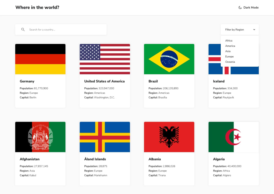
Nice project! Here are a few suggestions for improvement:
Mobile-First Approach: Your site currently isn’t responsive. To make your site easily responsive, consider using a mobile-first approach. Think of your site as a tower: if you start by building a solid foundation (mobile design), it will be easier to expand and adapt for larger screens. If you start with the top (desktop design), you’ll need more CSS to fix issues on mobile devices.
Mobile is the most important device nowadays, so ensuring it looks great on phones first is crucial. Use media queries to adjust the design for larger screens after establishing a solid mobile base.
Translate Border Names: To improve user experience, consider translating border abbreviations (like FRA) to their full names (e.g., France). This will make your content more accessible and understandable for all users.
Hope this was helpful
Best, Teodor
Marked as helpful
@Kamelek1337
Posted
Hi @TedJenkler,
Thank you for your feedback, it is very helpful and detailed, I will try to improve the things you mentioned, but I would like to ask you what mobile device you used to visit my website because I checked it on two phones and the website is responsive.
Best, Kamil
