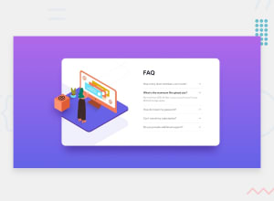
React Responsive Semantic Accordion Menu Component
Design comparison
Solution retrospective
I believe I am all finished with this project but there is a bug in the layout i don't like. When click on the accordion in mobile mode the width of the container expands and it looks a little weird. I don't know why its doing that. Its a small thing but it is annoying. If you know what is causing it, great! please let me know. Also I am still getting comfortable with React. If there are any best practices or things I can improve upon, all thoughts and comments are welcome. Thanks!
Community feedback
- @shashreesamuelPosted over 2 years ago
Great job Brian
Keep up the good work
Your solution looks great however I have some suggestions from the design perspective
-
The box-shadow on the card is supposed to subtle so try increasing the blur value for the
box-shadowproperty. -
The font-family of the card does not match the one specified in the
style-guide.mdfile -
The card title "FAQ" is supposed to be a lighter font weight.
-
The width of the orange arrow needs to be increased to avoid skewing the arrow (compressing)
-
The FAQ questions should be in a lighter font-weight
I hope this helps
Cheers
Marked as helpful1 -
Please log in to post a comment
Log in with GitHubJoin our Discord community
Join thousands of Frontend Mentor community members taking the challenges, sharing resources, helping each other, and chatting about all things front-end!
Join our Discord
