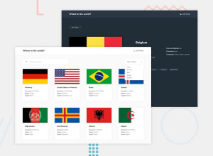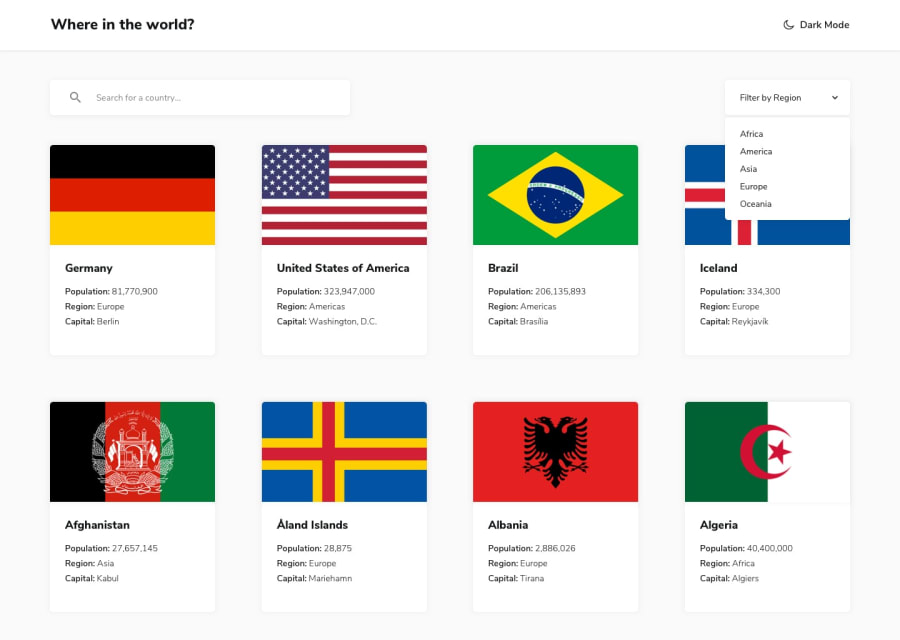
Design comparison
Solution retrospective
What is your opinion ? and any ideas about implementing dark mode? Thanks in advance :)
Community feedback
- @pikapikamartPosted over 3 years ago
Hey, great work on this. In terms of layout, the desktop is good and it resizes well when going in mobile state.
Haven't tackled this challenge, so only for the UI:>
- It will be better if you added some
box-shadowso that the article will be contrasted well enough against the background. - Adding some focus state on the interactive elements will be awesome as well. So that users who prefers using keyboard to navigate will be easily accessing those. Also for the article, since the article itself is a link. You could make use of
focus-withinin this. So that when the focus is on theatag inside the article, you could target thearticleto have some box-shadow or anything that will indicate that the user is in the element.
Regarding your query. A simple way is that, when the dark mode is toggled, in your js, you add some class like
dark-modeon thebodytag. Then in your css, you can just make use ofbody.dark-mode { different declarations. Target the different selectors that you want to be in dark-mode. I don't know react but is css nesting allowed in it? }This way, when the dark-mode is added, everything inside it will run.
Overall, great job on this one^^
1@DevMoustafa97Posted over 3 years ago@pikamart thank you very much for your notes I'll try to add some focus state to the elements and implement the dark mode using the way you mentioned thanks again and have a nice day :)
0 - It will be better if you added some
Please log in to post a comment
Log in with GitHubJoin our Discord community
Join thousands of Frontend Mentor community members taking the challenges, sharing resources, helping each other, and chatting about all things front-end!
Join our Discord
