Submitted 11 months ago
React / React Hook Form / Styled Components
#react#styled-components#typescript#vitest
@AurelienWebnation
Design comparison
SolutionDesign
Solution retrospective
What are you most proud of, and what would you do differently next time?
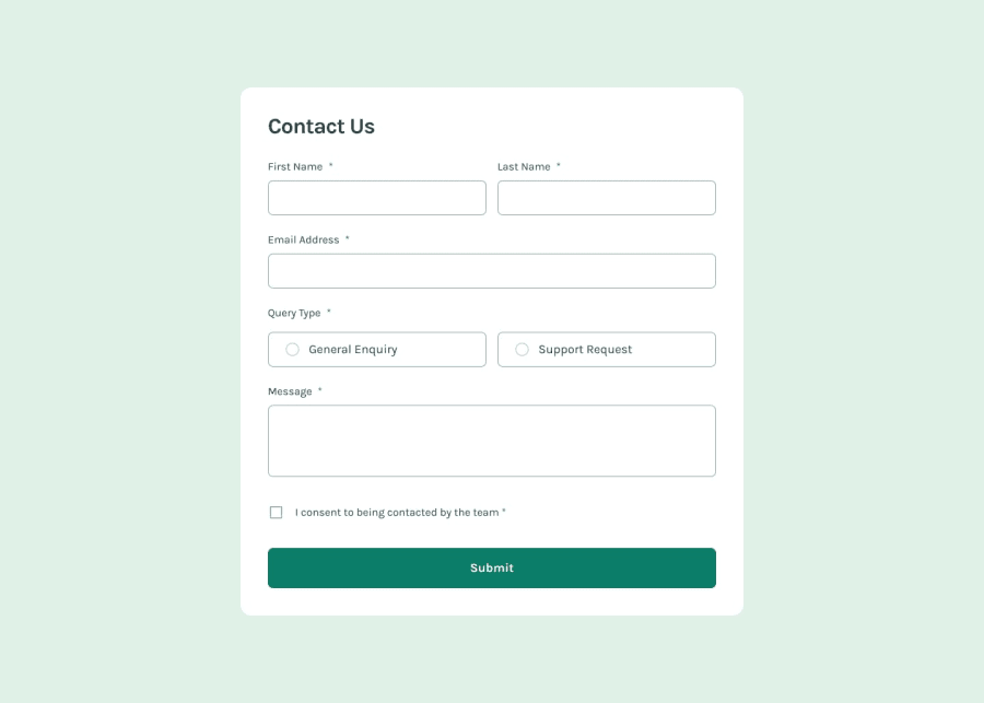
At first glance the challenge seems rather simple. But it's a lot harder than expected! I tried to create the most generic form possible from my level, and the simplest to use. I think I can improve the FormGroup component to add the Label inside him and automatically generate the id and apply him to both label and input.
What challenges did you encounter, and how did you overcome them?I encoutered a lot of challenges, such as:
- The custome radio button
- The custom checkbox
- The layout with one colum on mobile and two columns on tablet and up
- The gap between the radio button, label and error message that is different from other inputs
I need some review on my layout and the custom input :
- My TwoColumns component is a good solution?
- My custom radio and checkbox input are good? I first create the icon myself with before and after element, but then I switched to use an svg icon with background property
Community feedback
Please log in to post a comment
Log in with GitHubJoin our Discord community
Join thousands of Frontend Mentor community members taking the challenges, sharing resources, helping each other, and chatting about all things front-end!
Join our Discord
