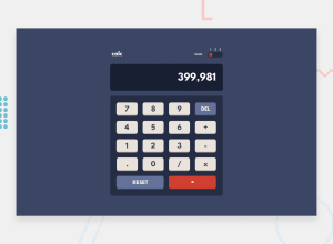
Design comparison
Solution retrospective
Mumbled at the calculator logic a bit more than I was anticipating. Still some bugs with the Delete button but for the most part it works. Wouldn't do my taxes using it though. lol
Community feedback
- @TheRealByteraverPosted about 2 years ago
The design is beautiful, I like the glowing buttons :) I noticed however that the theme selector doesn't work in the desktop version and that the colors are a bit off for the secondary themes, but I suppose you're aware of that. As with some other implementations, it is possible to type "outside" of the dialog containing the result of the mathematical operation, you might want to fix that ;) Nice work, keep it up +1
Marked as helpful1 - @jgreen721Posted about 2 years ago
Lol, ya good call on the numbers going outside the container. That doesn't happen with real life calculators!? haha. Honestly, whole project got me little salty on the calc logic so think its on the re-do/clean up list at some point but appreciate your observations. Theme picker should?? work on all sizes but its another area that could benefit from tidying so not surprised if you exp some bug. Colors definitely not entirely on the bullseye! 🙈
0
Please log in to post a comment
Log in with GitHubJoin our Discord community
Join thousands of Frontend Mentor community members taking the challenges, sharing resources, helping each other, and chatting about all things front-end!
Join our Discord
