Submitted 11 months ago
React project using Typescript and SCSS
#react#typescript#sass/scss
@dalnoki
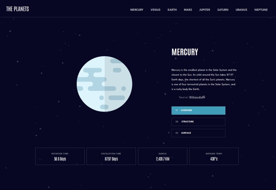
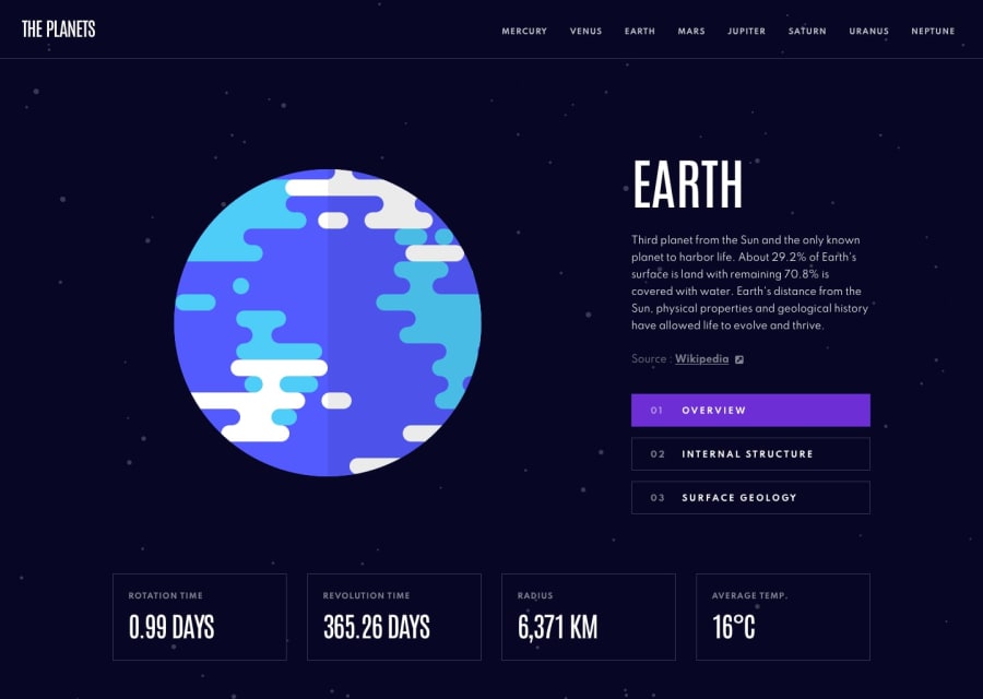
Design comparison
SolutionDesign
Solution retrospective
What are you most proud of, and what would you do differently next time?
I finally dipped my foot into Typescript - I'm pretty sure it can be done better but hey, it's a start! Otherwise, I was able to avoid a lot of CSS gotchas so overall I'm satisfied with the process.
What challenges did you encounter, and how did you overcome them?I learned a lot about routing, also, deploying the project to GH pages was quite tricky, but I Googled the hell out of it and I read a lot of documentation.
What specific areas of your project would you like help with?I spent a lot of time figuring out how should I set the width of the span in the nav in desktop resolution to match the width of the text, and my solution is not 100% so I'd appreciate any advice on that.
Community feedback
Please log in to post a comment
Log in with GitHubJoin our Discord community
Join thousands of Frontend Mentor community members taking the challenges, sharing resources, helping each other, and chatting about all things front-end!
Join our Discord
