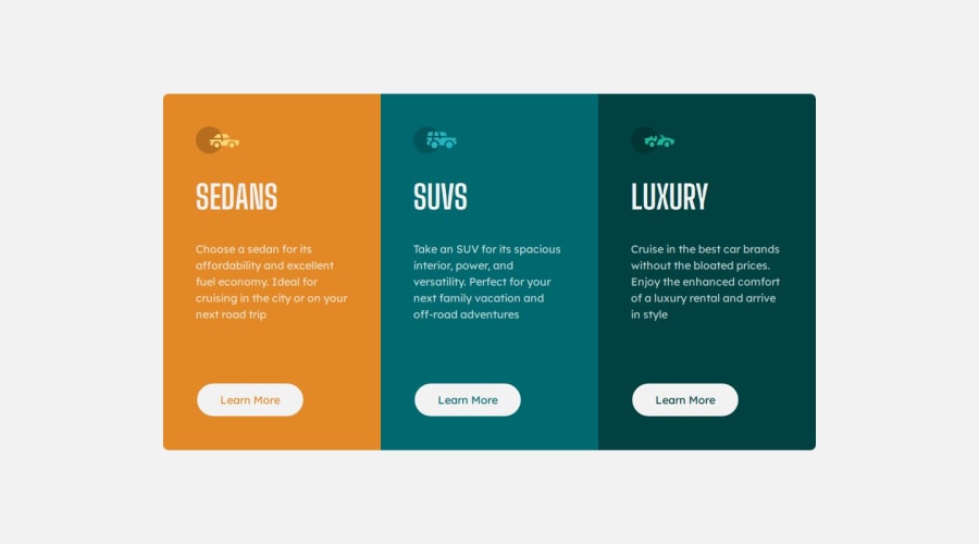
Design comparison
Solution retrospective
Use props to not have to repeat the card 3 times and only use the same structure. Use .map method and spread operator to lighten the code
Community feedback
- @AdrianoEscarabotePosted about 1 month ago
Hey Jérôme Girard, how’s it going? I was really impressed with your project’s result, though I have some advice that could be helpful:
I noticed that you used a button in which case the best option would be an a, because in my head when a person clicks on a button written
Learn more, he is not confirming a form, or something like, it will be redirected to another page, to Learn More about!to solve this problem do this:
<a href="/">Learn more</a>Everything else looks great.
Hope this helps! 👍
1@Jerome-girPosted about 1 month agoHey Adriano @AdrianoEscarabote thank you very much for your feedback, indeed a button would be more there to submit a form for example rather than to make a redirection so the
<a href>would be more relevant than a button in this case.1
Please log in to post a comment
Log in with GitHubJoin our Discord community
Join thousands of Frontend Mentor community members taking the challenges, sharing resources, helping each other, and chatting about all things front-end!
Join our Discord
