Design comparison
Solution retrospective
Hi,
I would like to know if you guys have some tips when it comes to creating better React apps. Thanks.
Community feedback
- Account deleted
Hi there 👋
Congratulate on finishing your project 🎉. The design looks beautiful 😃. Sorry but I don't know the react yet 🚀
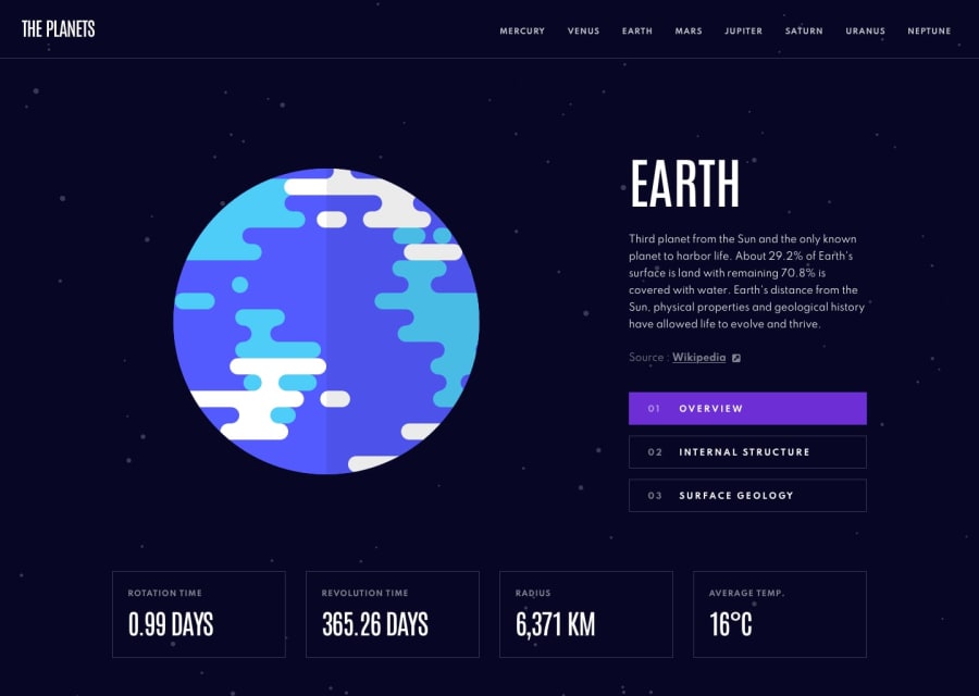
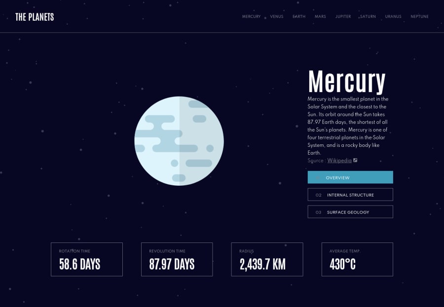
I hope these suggestions help you to improve your design a bit 🤏. Four squares at the bottom, their border colors look white in your design which should be a darker color. And about planet 🌎 names in the navigation make them a white or close to white color. I think you made a mistake while choosing their color 😁.
Happy coding ☕
1@kremenovicPosted almost 3 years ago@maqsudtolipov Hi there, thank you for taking the time to give me feedback! :)
I'm gonna check those colors since I was taking colors from the Figma, so maybe I made some mistake. :)
In this project, I was mostly focused on the React part and making it work.
Happy coding! :D
0
Please log in to post a comment
Log in with GitHubJoin our Discord community
Join thousands of Frontend Mentor community members taking the challenges, sharing resources, helping each other, and chatting about all things front-end!
Join our Discord