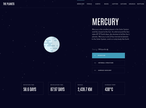
Design comparison
Solution retrospective
How could I refine the State Management for the Desktop NavBar?
Community feedback
- @awexliPosted almost 3 years ago
Hey Logan, great question.
A good starting place is to improve your component by mapping (looping)
<DesktopNavBarPlanets />
instead manually of creating one for each planet. This way, you are not repeating code.For example:
{planets.map((planet) => { return ( <DesktopNavBarPlanets ... planet={planet.name} /> ); })}
For state management, you can use one state that takes in the name of the planet, so a string instead of a boolean.
For example:
const [selectedPlanet, setSelectedPlanet] = useState(planets[0].name)
In the
<DesktopNavBarPlanets />
component you can then check if theselectedPlanet
matches withprops.planet
. If it matches style the border, otherwise leave it transparent.For example:
style={ props.selectedPlanet === props.planet ? { borderTopColor: `var(--${props.planet}-theme)` } : { borderBottomColor: 'transparent' } }
As for changing state
onClick
, you’ll have to update theselectedPlanet
state. I’ll leave that to you to figure out :-)Marked as helpful1@LogvnRPosted almost 3 years ago@awexli Hey thanks a lot for that suggestion! I have gone back and refactored that section and it is what I wanted to achieve, to begin with!
I had originally used .map() on the desktop navbar, as it is what I did for the mobile version, but I couldn't get the color on the top of the tabs to change when each one was clicked. I had never thought about using state and then comparing the state to the planet name to apply the styles that way. Definitely, something I'll remember for the future.
Again, thanks for taking the time to offer a suggestion!
1
Please log in to post a comment
Log in with GitHubJoin our Discord community
Join thousands of Frontend Mentor community members taking the challenges, sharing resources, helping each other, and chatting about all things front-end!
Join our Discord