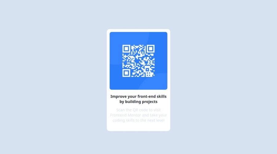
Design comparison
Solution retrospective
- The font styling for the paragraph was a bit different, I wasn't exactly sure how to get it to be the exact same as the example. Ideally I'd like some headers on why my font styling wasn't the same as the provided example.
- I know the challenge was designed for the white box to be a static size but for dynamic sizes what would I do?
- Were there any accessibility issues that I missed? I know this was a small project but I'd like to know how to make this accessible to everyone.
Community feedback
- @danielmrz-devPosted 10 months ago
Hello @jchu62!
Your solution looks great!
I have a couple of suggestions for improvement:
- First: In order to make your HTML code more semantic, use
<h1>for the main title instead of<p>. Unlike what most people think, it's not just about the size and weight of the text.
📌 The
<h1>to<h6>tags are used to define HTML headings.📌
<h1>defines the most important heading.📌
<h6>defines the least important heading.📌 Only use one
<h1>per page - this should represent the main heading/title for the whole page. And don't skip heading levels - start with<h1>, then use<h2>, and so on.- Second: Still about semantic HTML, use
<main>to wrap the main content instead of<div>.
All these tag changes may have little or no visual impact but they make your HTML code more semantic and improve SEO optimization as well as the accessibility of your project.
I hope it helps!
Other than that, great job!
Marked as helpful1 - First: In order to make your HTML code more semantic, use
- @shaihumohammedPosted 10 months ago
the information about this and other stuffs are in the style-guide.md in the starter file you downloaded. hope this is helpfull :)
p {
color : hsl(220, 15%, 55%)
}
1
Please log in to post a comment
Log in with GitHubJoin our Discord community
Join thousands of Frontend Mentor community members taking the challenges, sharing resources, helping each other, and chatting about all things front-end!
Join our Discord
