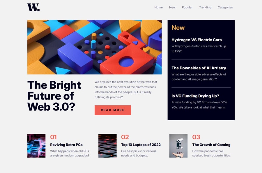
React-News-Homepage
Design comparison
Solution retrospective
–tabbing works great for the menu in the small screen version. –smooth transitions for the menu and backdrop.
What challenges did you encounter, and how did you overcome them?One challenge was hiding the visually hidden menu for the tab button. If the menu is behind the viewport and there is set overflow:hidden on the parent with the pressing tab button next tab element will be visually focused and the visually hidden menu exposed. That was solved by dynamically controlling tabIndexes according isMenuOpen state and focusing the first element in the menu by the native focus method which was triggered by ref. Also controlled dynamically aria-hidden attribute for the open and closed menu.
What specific areas of your project would you like help with?If anyone has any ideas for closed menu implementation please be my guest.
Community feedback
- @salomasikPosted 5 months ago
Cool and very design-conscious. Some links do not respond to mouse hover. Cool animation on the mobile version!!!!!!
0
Please log in to post a comment
Log in with GitHubJoin our Discord community
Join thousands of Frontend Mentor community members taking the challenges, sharing resources, helping each other, and chatting about all things front-end!
Join our Discord
