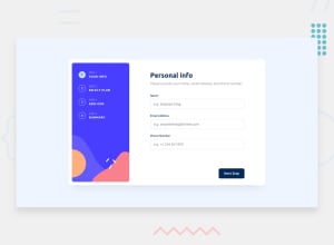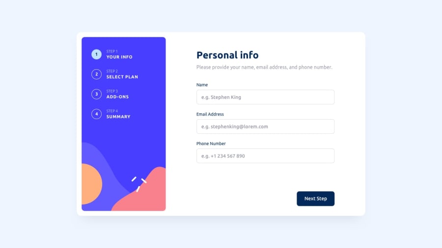
Design comparison
Solution retrospective
I'm glad I was able to get the functionality working smoothly, ensuring that the application performs its intended tasks effectively. However, I feel that I could have improved the styling aspect of the project. Next time, I would allocate more time and attention to refining the visual presentation, ensuring it meets the highest standards of design and user experience.
What challenges did you encounter, and how did you overcome them?During the project, one of the main challenges I encountered was related to the styling aspect. I found it challenging to achieve the desired visual appearance and user interface design. To overcome this challenge, I first carefully reviewed the design specifications and requirements to gain a clear understanding of the intended look and feel.
Next, I experimented with various CSS techniques, such as flexbox, grid layouts, and CSS frameworks, to structure the layout and style the components effectively. Additionally, I leveraged tools like browser developer tools to inspect and debug the CSS styles applied to different elements.
What specific areas of your project would you like help with?In terms of the project, I would appreciate assistance and guidance specifically in improving the styling aspects. This could include suggestions on enhancing the layout, refining the color scheme, optimizing typography, and making the overall design more visually appealing and cohesive. Additionally, advice on best practices for responsive design and ensuring cross-browser compatibility would be beneficial. Any insights, tips, or resources related to frontend design and styling would be greatly appreciated to elevate the overall aesthetics and user experience of the project.
Community feedback
Please log in to post a comment
Log in with GitHubJoin our Discord community
Join thousands of Frontend Mentor community members taking the challenges, sharing resources, helping each other, and chatting about all things front-end!
Join our Discord
