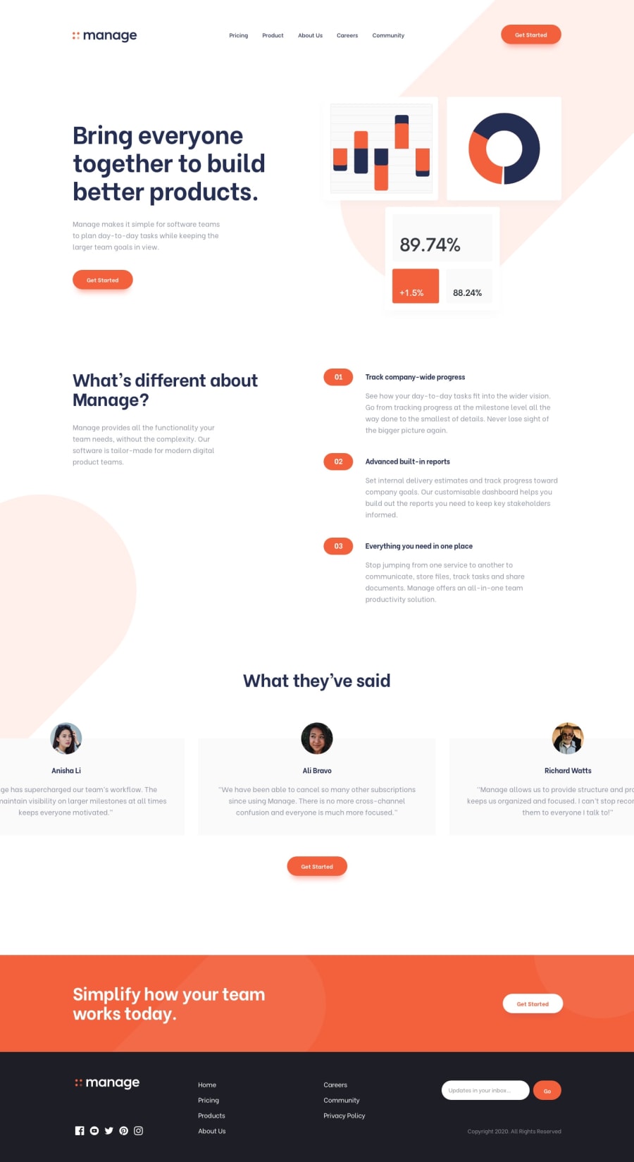
Design comparison
Solution retrospective
The first venture using React. Loved it! If there are any pros that want to pass their expert eye over my code I'd welcome any feedback. I'm not sure yet of best practices and would appreciate this being pointed out to me.
And if anyone has any advice on pushing React apps with routing that would be really good! I want to try this out in a future build and I can see that adding a React app with routing needs a few extra steps and I'm unsure where to start looking.
Community feedback
- @denieldenPosted almost 2 years ago
Hello Steven, You have done a good work! 😁
Some little tips to improve your code:
- add
headertag and wrap the navbar for improve the Accessibility - use
articletag to the container a specifies independent, self-contained content like a card, forum post, news... not for the "slider" section of site - remove all unnecessary code, the less you write the better as well as being clearer: for example the
articlecontainer of image withhero-imageclass - you can use
picturetag to change image by resolution -> read here - add the image directly to the body
backgroundwith css instead of usingimgtag with class.pill--lg - for floating menu use less
useStatewith this logic: you first hook into the menu button's dom node via arefand then use a state to define whether the panel is open or closed ref guide - read here
const refNavBar = useRef(),
	   [isOpen, setIsOpen] = useState(false),
	   handleToggle = () => setIsOpen(!isOpen);
Then you restructure the html of the menu like this by adding the nav toggle button and the control over the
navelement:<header> <a> <svg logo /> </a> <button className="nav-toggle" aria-controls={refNavBar} aria-expanded={isOpen} onClick={handleToggle} /> <nav ref={refNavBar} data-visible={isOpen} > <ul> ........ </ul> <a href="#nogo" className="button">Get Started</a> </nav> </header>finally through the css/scss manage the menu icon and whether to make it appear or not:
button.nav-toggle {
	background: url(  icon-hamburger  );
}
button.nav-toggle[aria-expanded="true"] {
	background: url(  icon-close    );
}
nav {
	opacity: 0
}
nav[data-visible="true"] {
	opacity: 1
}

@include u.breakpoint(lg) {
    button.nav-toggle { display: none; }
}
Keep learning how to code with your amazing solutions to challenges.
Hope this help 😉 and Happy coding!
Marked as helpful0@satropPosted almost 2 years ago@denielden Hey there. Thanks for some pointers but...
<article>- tag, I originally had my<div class="section">in section tags and this was throwing ADA warnings and I completely forgot about<articles>, nice easy fix.<picture>- didn't use this as it wasn't requested and the image was so small to start but yeah, as a standard your right<picture>- tags are the way to go.I disagree with adding the pill image as a background image, if you take a deeper look at my code I remade the pills via CSS, which will lower the page weight. And should there be a color change, it's easy to update.
Dig what you're saying about the nav and I'll have a deeper dive into this with other builds, thanks for that.
1@denieldenPosted almost 2 years ago@satrop Pills via CSS is a great optimization, what I meant is that you can handle them in the css via
:beforeor:afterwithout affecting the html of additional nodes.What do you want me to dig more about
nav?Marked as helpful0@satropPosted almost 2 years ago@denielden oooh! Of course!! I didn’t think about doing that way. I like that approach a lot more. Thanks for that!
And for sure you can dig into the nav if you have time. That found be great.
1 - add
Please log in to post a comment
Log in with GitHubJoin our Discord community
Join thousands of Frontend Mentor community members taking the challenges, sharing resources, helping each other, and chatting about all things front-end!
Join our Discord
