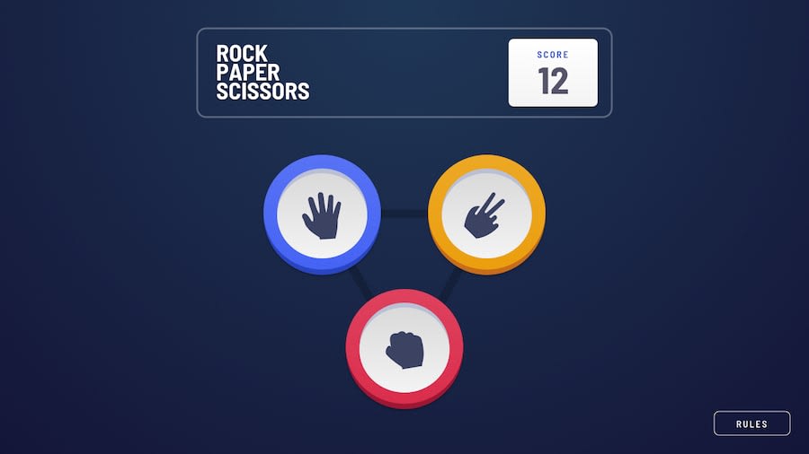
Design comparison
SolutionDesign
Solution retrospective
I put myself on a time limit for this project. Which unfortunately left me with some weaknesses in the end result.
I sacrificed the Mobile/Desktop versions in replacement for a single markup. & aligning the victory backlight circles. If perfect choices, having an SVG of the victory circles might have been better than trying to manipulate CSS to create those affects.
Any feedback anyone could provide on a good way to align those circles would be much appreciated.
Thank you
Community feedback
Please log in to post a comment
Log in with GitHubJoin our Discord community
Join thousands of Frontend Mentor community members taking the challenges, sharing resources, helping each other, and chatting about all things front-end!
Join our Discord
