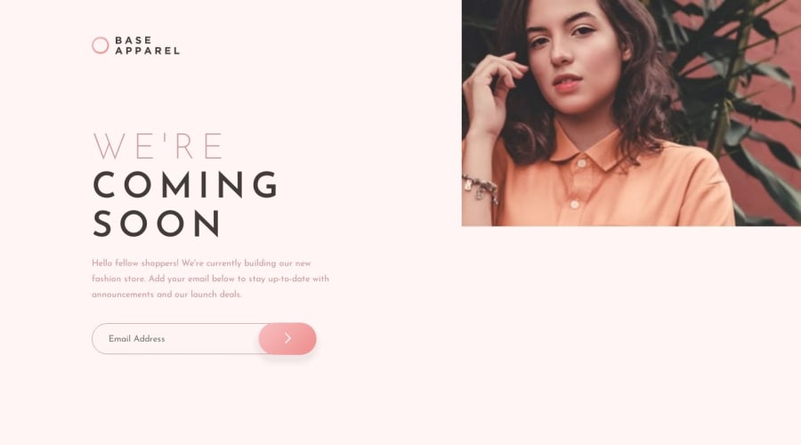
React Landing Page using Styled-Components
Design comparison
Community feedback
- @davidkartuzinskiPosted over 4 years ago
Thanks. I am doing these challenges to improve my React skills. In real life, these types of components are part of everyday work.
My goal is to be able to build these components in under one hour. I can do this with just HTML and CSS, and now need to be able to do the same when adding logic.
Also, you can take my code and easily change one line of code to collect the email addresses like a real sign-up page.
I appreciate your feedback, and hope you understand that I have a different reason for implementing these challenges!
1 - @akdscoPosted over 4 years ago
So what happened with the right photo? Not rendering as on design? The background looks like it's no gradient / bg pattern applied?
0@davidkartuzinskiPosted over 4 years agoI don't know. It's on the live version but not the snapshot. I will probably redo this one because I am not happy with the form. But the LIVE url has the image. I tried everything to get it to work here.
1@akdscoPosted over 4 years ago@davidkartuzinski I looked into your code, and I found it quite complicated considering the challenge. It's always useful to practice, so certainly praise for going with React and Styled Components. However, I also noticed you used some optimisation tools from the React itself. This looks like a bit of an overkill on top of an overkill for the task for me. Please do take it as constructive feedback, certainly not trying to put you down here. I think what you could be reminding yourself in those small tasks is this:
"...I'd just like to wrap this up by saying that every abstraction (and performance optimisation) comes at a cost..."
This quote comes from this first article I found about useCallback() hook, which I didn't even know exists until today, so thanks for introducing me :)
Have a full read if you're curious: https://kentcdodds.com/blog/usememo-and-usecallback
1 - @marcelobueno25Posted over 4 years ago
Ficou legal, mas eu colocaria cursor:pointer; no button e outline: none; no input.
Abraço.
0@davidkartuzinskiPosted over 4 years agoThank you Marcelo,
I removed the outline and made the cursor a point. Good ideas! Thank you.
1
Please log in to post a comment
Log in with GitHubJoin our Discord community
Join thousands of Frontend Mentor community members taking the challenges, sharing resources, helping each other, and chatting about all things front-end!
Join our Discord
