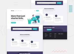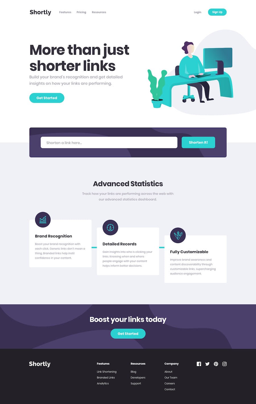
Design comparison
Solution retrospective
Hello everyone thanks can you see my solution and give me a feedback I made this with React.js JSX - Hooks - Tailwinds css - Axios for fetching data from the API
Community feedback
- @BurritoDoggiePosted over 3 years ago
hello Yahya,
I love it the way the 'getting started' button bounces up and down!!!!!!!!!!!!!!!!!!!!!!!!!!!!!!!!!!!!!! I think it is super cool!!!! I also like the fact that the 'link shortener' actually works. It is really neat. And the hamburger menu, can we forget the fact that you added that? NEVER!!!!!!! We can never forget the great effort you put into for people with small screens Great Work!
Keep Coding!
(@@) \__/2@coding404lifePosted over 3 years ago@BurritoDoggie Hello Burrito thanks so much for the FeedBack I appreciate it I have built it with tailwinds CSS and react the animation is included in the tailwinds framework its an awesome framework Best regards :)
1 - @RocTanweerPosted over 3 years ago
Salam ,
Amazing! your project is actually working...
I wish to share some things with you if you allow me...
- Features, Resources and Company and their contents should be a link, wouldn't you agree? Like About, Blog, Support, etc.
- Social icons should be cursor pointer...
Hope it helps
0@coding404lifePosted over 3 years agosalam Hello thanks so much for the feedback I appreciate it and I'm an anime fan too Best regards :)
1
Please log in to post a comment
Log in with GitHubJoin our Discord community
Join thousands of Frontend Mentor community members taking the challenges, sharing resources, helping each other, and chatting about all things front-end!
Join our Discord
