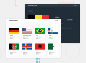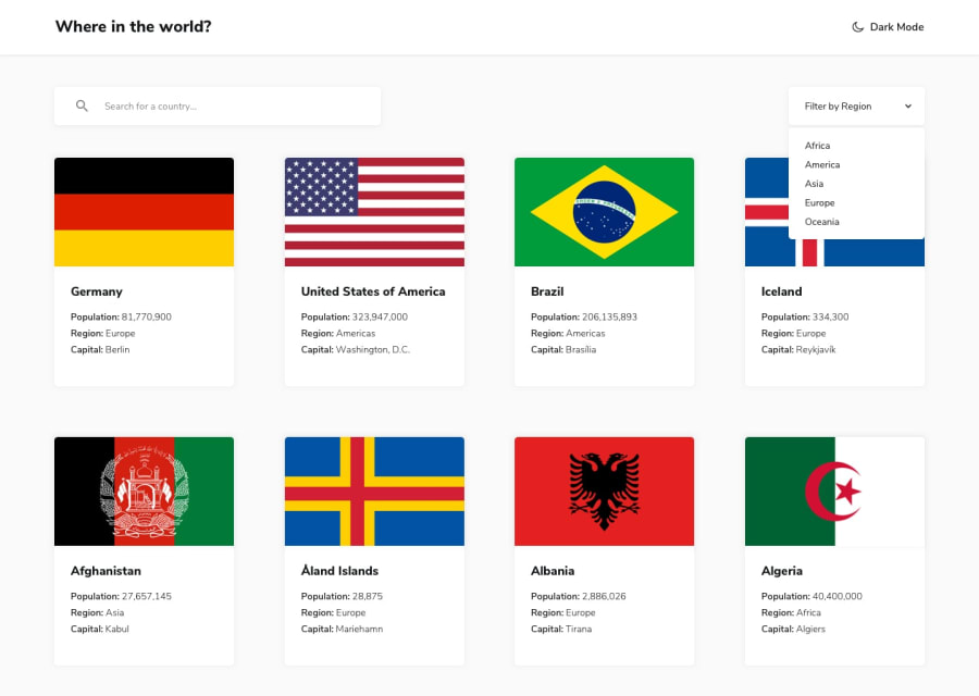
Design comparison
SolutionDesign
Solution retrospective
Hi all,
Thank you for checking out my solution, feedbacks are most welcome. For this challenge, I've made some differences from the challenge's requirement , in terms of showing the modal instead of redirecting to a new page, and slight rounded borders for each country.
It turned out pretty well in my opinion. Though, any suggestions for further improvement are welcome as well.
Community feedback
Please log in to post a comment
Log in with GitHubJoin our Discord community
Join thousands of Frontend Mentor community members taking the challenges, sharing resources, helping each other, and chatting about all things front-end!
Join our Discord
