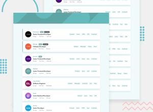
Design comparison
Solution retrospective
Minha maior dificuldade foi com css,logica para diminuir a quantidade de codigo é consumir de forma dinamica a lista de trabalhos
My difficulty was with css, logic to reduce the amount of code and dynamically list the work list
Community feedback
- @mickygingerPosted over 3 years ago
Hey Kenji 👋
You've set the margin on the
MainContainerto be120px 0px;which is why your listings are so spread out. I would recommend something like10px 0;Rather than using
mainI would recommendarticle, or even justdiv. Themaintag is designed to be the contain all of the content of the page, and there should only be one of them per page. Check out the docs for more info.Great use of the
:beforepseudo-element to add the green highlight to the left of the listing. I think you can probably pair it down a little though to closer match the design. Perhaps something like:display: block; content: ""; width: 0; height: 100%; border-left: 5px solid rgb(92, 165, 165); position: absolute; left: 0; border-radius: 40px 0 0 40px; margin-left: 0;Note you don't need to add units eg
pxwhen setting values to 0.Hope that helps!
0 - @avizmarquesPosted over 3 years ago
Ola Kenji, bom trabalho.
I see you learned about styled components, those are a great option indeed. You can checkout this library that does styled components in a fast way => https://linaria.dev/
I'm a huge fan of Tailwind for styling, it's for me by far the fastest way to create styles with little code. You can do responsiveness and dark mode with it, and pretty much everything with it. I use mostly this, sometimes styled components, and it has made my life a lot easier. Check it out => https://tailwindcss.com/
0
Please log in to post a comment
Log in with GitHubJoin our Discord community
Join thousands of Frontend Mentor community members taking the challenges, sharing resources, helping each other, and chatting about all things front-end!
Join our Discord
