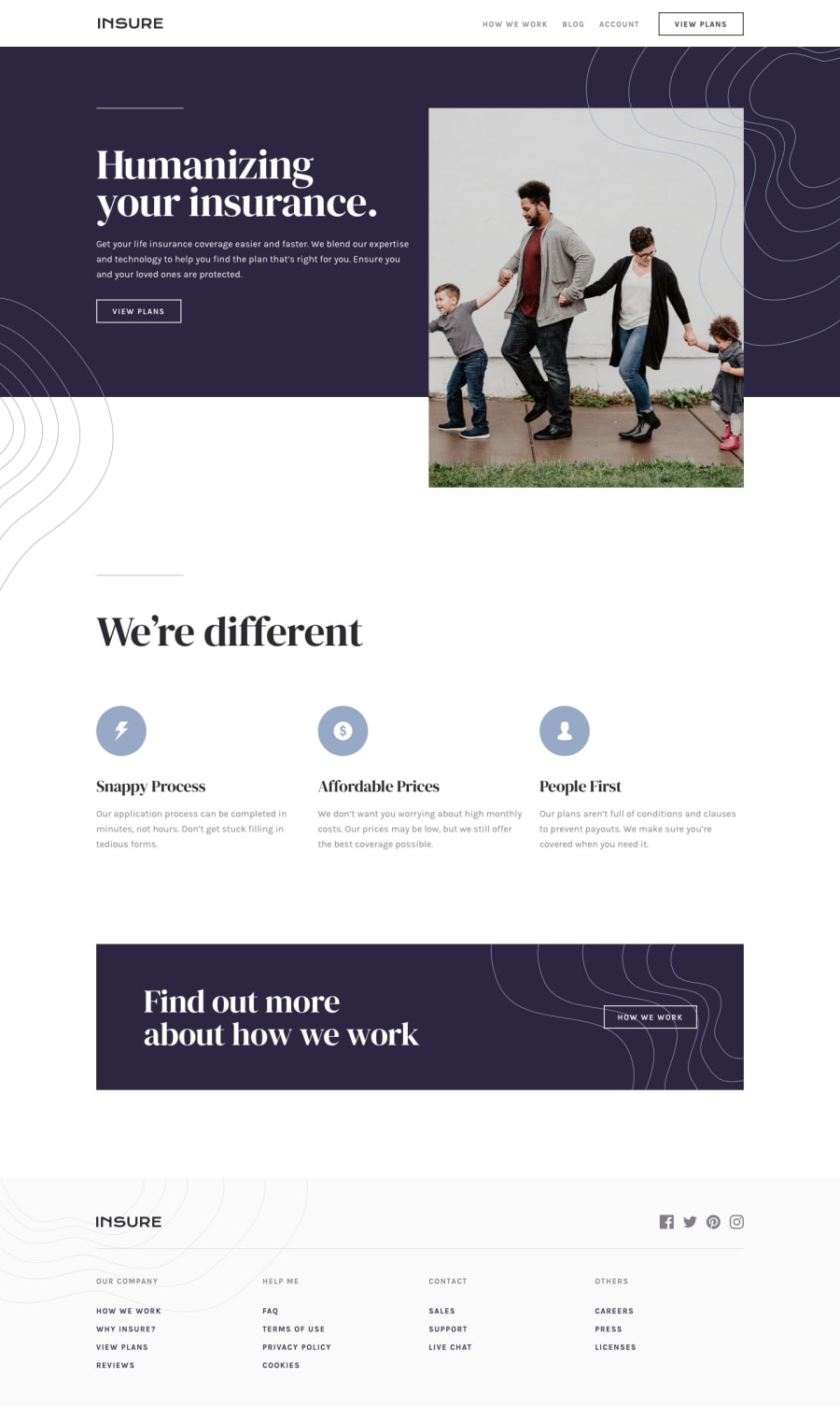
Design comparison
Solution retrospective
Looking for tips for structuring. Normally, I would put a page in a folder and put its contexts in it. But since this is just a landing page, I just let them be. Any feedbacks are deeply appreciated.
Community feedback
- @ApplePieGiraffePosted about 4 years ago
Oh, yes—very nice solution, Mcklien Ross! 😍
One really tiny thing—there seems to be an issue with the hover state of the button in the hero section of the page. For some reason, the hover state only appears if you hover over the far left side of the button.
Happy coding! 😁
1@mcktivityPosted about 4 years ago@ApplePieGiraffe Although I cant replicate the problem you had encountered, I can only assume that you must have been using a smaller screen. it could have been the image pattern was on top of the button or another element with transparent background. Anyway, you have good eyes and that was a nice catch!
0 - @brasspetalsPosted about 4 years ago
While I'm far too much of a beginner to give any structuring tips, I just wanted to drop in and compliment your practically pixel-perfect solution. 🙌 Overall, it's just very beautifully done, and it'll definitely serve as an inspiration point for me when I do this challenge.
1
Please log in to post a comment
Log in with GitHubJoin our Discord community
Join thousands of Frontend Mentor community members taking the challenges, sharing resources, helping each other, and chatting about all things front-end!
Join our Discord
