Design comparison
Community feedback
- @IsmaaaPosted over 4 years ago
Very well done Marco !
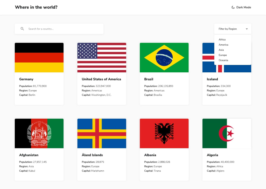
The only thing that I could say is that the icon is wrong, it should be the half moon :) And as a small detail, the placeholder of the text input, the title and the filter drodown should be bold. On the chevron you could use an absolute positioning so you can put it right where you want. Right now It's a bit moved to the right, but you could fix it with that
0@MarcoMaderaPosted over 4 years ago@Ismaaa Thanks for pointing that out, I tried upping the font weight a bit but it didn't convince me. As in the challenge there are no assets, and we had to look for an icon, I preferred it to be the sun for the light theme and the half moon for the dark one, it is more intuitive.
I first did the filter by continents with select option form, but it doesn't have many options to style it, so the chevron looked like that, I already changed that.
0
Please log in to post a comment
Log in with GitHubJoin our Discord community
Join thousands of Frontend Mentor community members taking the challenges, sharing resources, helping each other, and chatting about all things front-end!
Join our Discord
