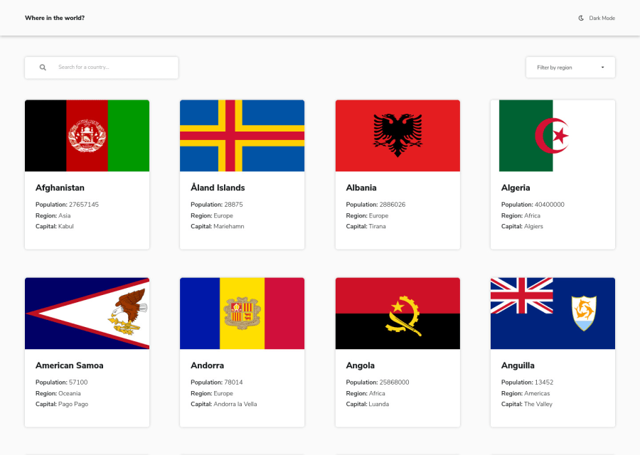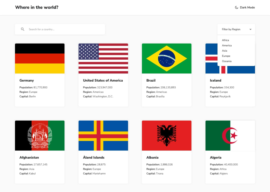
Design comparison
Solution retrospective
Hi, community I've enjoyed a lot when was doing this challenge and I think I've completed it pretty well (any feedback is welcome). I've also added some active states styles. But there are some issues that I don't know how to fix:
- Looks like it's difficult to load styles for the app. First it shows the app data and then loads widths, margins etc. I'm not sure how to explain it..
- When I open the app from my mobile - countries flag images aren't the full width of it's container. The styles are:
.country-card { max-width: 262px; }.country-card__flag { width: 100%; height: 161px; }.country-card__flag image { height: 100%; width: 100%; }.
When I inspect it in chrome dev tools - uncheck and then check width of image it shows correctly. Thank you for checking my solution and happy coding to everyone :)
Community feedback
- @MatthiasSmithPosted over 3 years ago
Hi @gelizabeth.
Looks great! Love the smooth transition between dark and light modes.
Something I noticed while testing is that refreshing the browser when you're on a country's page causes a 404 error. Is it a router issue?
And two small things: The title tag of the website is "React App." And the favicon isn't loading in my browser tabs.
Awesome work!
2@gelizabethPosted over 3 years agoHi @MatthiasSmith, thank you a lot for your feedback.
I've fixed those issues. I'm not sure why 404 error happens and I think this happens only when deploying react app to Netlify - to fix that I've added
_redirectsfile topublicfolder and now it works. Link to problem solutionThank you again and have a nice day!
0 - @AgataLiberskaPosted over 3 years ago
Hi @gelizabeth, I'm not sure how helpful this is but I don't really see the issues you mention. Styles load immediately, only the flags take a bit longer, but it's still only a second, if that.
There are a few flags which don't stretch the width or height of the container both on desktop and mobile (like Aruba or Australia - not sure if that's what you meant?). But honestly viewing the page as a user I'd just think that some flags have a different aspect ratio and that's it? Sorry I can't help more, I'm not really familiar with this challenge!
I did notice one small thing - I think there's a transition missing on the search field - it toggles between light and dark mode differently than the rest of the page.
Overall though I think it looks great, it's responsive, the hover states look great, too. You could maybe scale the cards down a tiny bit in
:activestate?Hope this helps at least a little bit lol :D
2@gelizabethPosted over 3 years agoHi @AgataLiberska, Thank you for your feedback.
Actually thanks to your comment, when I was thinking how to explain what I wanted to do with that flag images (to do
background-size: cover;but to an image tag), I've had an idea to apply this as inline styles directly to flag element in html part and then to adjust it in css. I don't know if this is a good practice, but it works. Thank you a lot again :DI've fixed that search field issue and added cards scaling down on hover too. That looks sooo interesting and smooth.
Thank you, you've helped me a lot!
0 - @ApplePieGiraffePosted over 3 years ago
Hi there, Elizabeth! 👋
Well done on this challenge! 👍 Your solution looks good, is responsive, and the light/dark themes work well! 👏
A tiny idea I have is to perhaps have the country cards break into a two-column layout at around 700px (rather than just a one-column layout), since I think there's room for a two-column layout and there'll be less empty space to the sides of the cards, then. 😉 Just a suggestion! 😀
Keep coding (and happy coding, too)! 😁
1@gelizabethPosted over 3 years ago@ApplePieGiraffe Hi! Thank you! I will try to implement that soon. Have a great day! :)
1
Please log in to post a comment
Log in with GitHubJoin our Discord community
Join thousands of Frontend Mentor community members taking the challenges, sharing resources, helping each other, and chatting about all things front-end!
Join our Discord
