Design comparison
Community feedback
- @Saad-HishamPosted over 1 year ago
Great job✨ on your work so far! Your functionality and validation are perfect! I just wanted to offer a few friendly tips to make it even better.
Firstly, for better structure and accessibility, it might be a good idea to wrap your app in a <main> tag instead of a <div>.
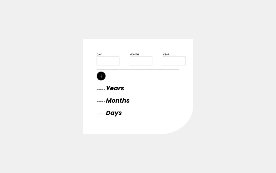
Secondly, I understand that you were more focused on logic, but it's important to pay attention to the design as well. Here are a few adjustments you can make to improve the design:
To fix the sizes, you can use the following code:
.wrapper {
max-width: 842px;
max-height: 651px;
}
To fix the button color and position, you can use the following code:
//this is the parent div of divider line
div {
position: relative;
}
button.my-button {
position: absolute;
top: -22px;
left: 91%;
width: 4rem;
height: 4rem;
background: #6d30a9;
border: none;
}
The rest of your work looks great, keep it up🔥
0
Please log in to post a comment
Log in with GitHubJoin our Discord community
Join thousands of Frontend Mentor community members taking the challenges, sharing resources, helping each other, and chatting about all things front-end!
Join our Discord
