Submitted over 2 years ago
React JS, HTML, CSS, React-router
#react#react-router

@nicnic31

Design comparison
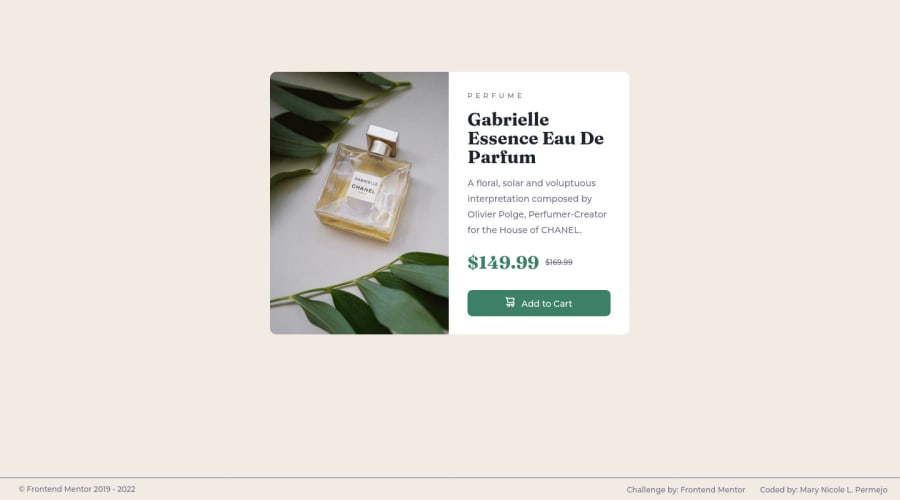
SolutionDesign

Solution retrospective
- Building the project was not difficult since I analyzed and studied the challenge first before I did the project. I faced a problem when I'm deploying the project in Github since it displayed only a blank page. I tried also the Netlify but then it did not display the page. But thankfully I figured out how to solve my problem.
- None.
- None.
Community feedback
Please log in to post a comment
Log in with GitHub
Join our Discord community
Join thousands of Frontend Mentor community members taking the challenges, sharing resources, helping each other, and chatting about all things front-end!
Join our Discord