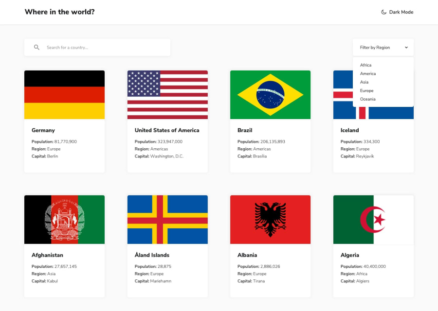
React JS, grid, responsive, dark mode, local storage + error page
Design comparison
Solution retrospective
Made some small changes from the original project given by FE mentor.
Any feedback is appreciated.
Community feedback
- @ApplePieGiraffePosted over 3 years ago
Hello there, Claudio! 👋
Well done on this challenge! 👍 Your solution looks good and works very well! 👏 I like the extra details you added (such as the planet earth favicon and the loading indicator that displays when navigating between pages)! 😀
I only suggest giving the search box and drop-down menu focus states so that keyboard users can easily know when those elements are in focus. 😉
It also might be worth taking a look at your solution report and trying to clear up some of the errors that are there in order to improve the accessibility and semantics of your solution (since there seem to be quite a few, at the moment).
Keep coding (and happy coding, too)! 😁
Marked as helpful1@leaninghowtousegitPosted over 3 years ago@ApplePieGiraffe Will be solving those errors in the near future Applepie, thanks for the feedback!
Wish you the best :)
1
Please log in to post a comment
Log in with GitHubJoin our Discord community
Join thousands of Frontend Mentor community members taking the challenges, sharing resources, helping each other, and chatting about all things front-end!
Join our Discord

