Design comparison
Solution retrospective
It was a good challenge , I learned a lot , but I think it can be improved. Please give some feedback on my code and UI design.
Community feedback
- @asbhogalPosted over 1 year ago
Hi Jyotirmoy,
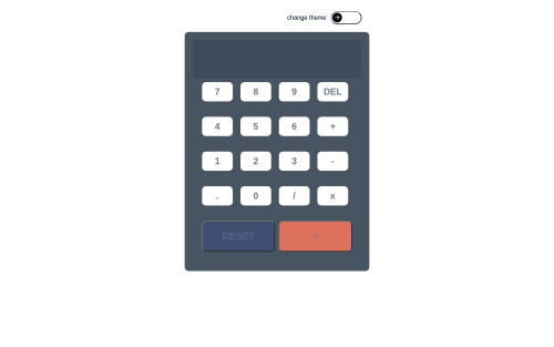
Good attempt. I can see you've got the logic down however there are some serious issues with the UI, UX and accessibility:
- The previous operands overlap the current/evaluated operand in the parent container when you have a digit value entered which extends the width
- When a new operation is entered, this isn't appended to the end of the previous operand, it replaces the operation previously entered (e.g.
1 + 2 - 3
ends up becoming1-23
) - Your theme also switches suddenly in responsive view (ie. when I choose theme two, it goes back to theme one at a
min-width
of440px
whilst keeping the switch position the same) - It would be good to have the ability to enter in values and operations using the keypad on a keyboard
- Your design fails accessibility standards for background/foreground contrast ratios
- The buttons also don't have an accessible name for assistive technologies and screen readers
I'd suggest maybe sticking to the original style guide to start with until you have more experience with UI design.
Also, avoid using Create React App for any React applications moving forward. Meta no longer supports this and it's recommended in this instance to switch to Vite.
Hope this helps!
Marked as helpful0@jyotirmoy-sinhababuPosted over 1 year ago@asbhogal thank you for your comment. It is a very detail comment , I am really thankful that you have taken your time to review my project. I will try my best to learn from your comment.
1@asbhogalPosted over 1 year ago@jyotirmoy-sinhababu no problem at all, glad to help!
0
Please log in to post a comment
Log in with GitHubJoin our Discord community
Join thousands of Frontend Mentor community members taking the challenges, sharing resources, helping each other, and chatting about all things front-end!
Join our Discord