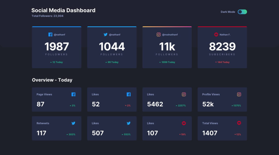
Design comparison
Solution retrospective
Hello, here is my solution. I used React to build the dashboard components and to manage theme state.
Community feedback
- @En-JenPosted over 4 years ago
Really nice execution!! It looks very close to the design, is responsive, and the theme switcher works great. The hover states on the cards also look really nice. The only things I would really suggest would be to vertically-center the dashboard within the viewport height. Also the design shows that when on the light theme when you hover over the switcher, the pill-shaped part of it should turn to the linear-gradient. The design also shows that the 'Overview - Today' heading should be a gray color on the light theme. Keep up the great work!!
1@GiovanniRanzatoPosted over 4 years ago@En-Jen Hello Jen, thanks for your feedback, I really appreciate it! I'll fix the solution following your guideline. Thanks again, Giovanni
0
Please log in to post a comment
Log in with GitHubJoin our Discord community
Join thousands of Frontend Mentor community members taking the challenges, sharing resources, helping each other, and chatting about all things front-end!
Join our Discord
