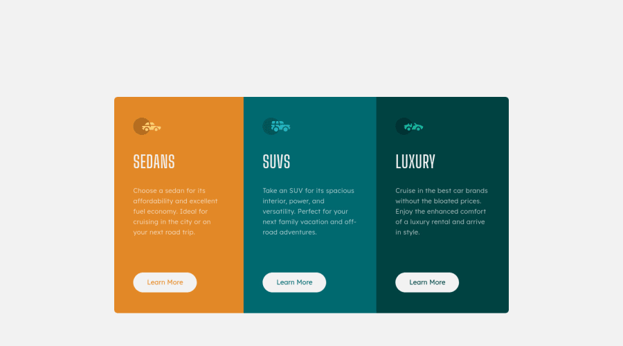


Design comparison

Solution retrospective
This is my first attempt at using Tailwind CSS. I was using dynamic classes so had to add them manually inside the tailwind config file. Is there a better way of doing this ?
Thanks
Community feedback
- @pikapikamartPosted over 3 years ago
Hey, awesome work on this one. Layout in desktop looks great, the responsiveness could be better like making the content adjust more on screen-size and the content is using a fixed width. The mobile layout looks great.
I don't use tailwind css but for other suggestions on the site, here are some:
- Always have a
mainelement to wrap the main content of your page. On this one, thedivafter the#rootshould be using amainelement. - Each car icons should be hidden since they are only decorative images so use
alt="'and addaria-hidden="true"on it so that it will be totally hidden. - Avoid using multiple
h1on page , you should only use 1 per page. Change those intoh2and the make theh1a screen-reader only text, meaning tit will be using like asr-onlyclass and it should be the first text-content inside themainelement, I expect for you to know this since you are using react by now. learn moreis more suited to be usingatag rather thanbuttonsince it is more likely to be a link to "learn more" about the car.
Aside from those, great work again on this one.
Marked as helpful0@Manmohan7Posted over 3 years agoHi @pikamart
Thanks for the feedback. I have updated my solution accordingly.
0 - Always have a

Please log in to post a comment
Log in with GitHub
Join our Discord community
Join thousands of Frontend Mentor community members taking the challenges, sharing resources, helping each other, and chatting about all things front-end!
Join our Discord