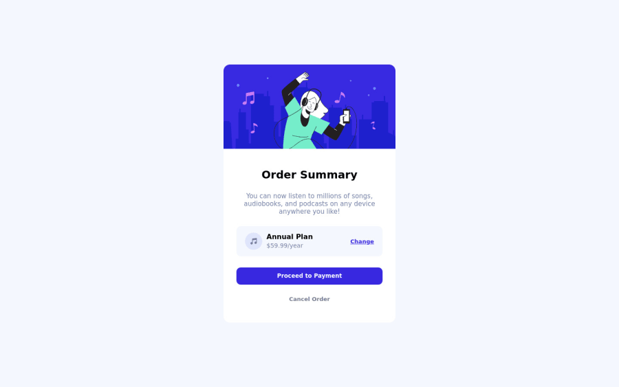
Design comparison
SolutionDesign
Community feedback
- @denieldenPosted about 2 years ago
Hi Kritika, congratulations on completing the challenge, great job! 😁
Some little tips for optimizing your code:
- To fix the top image in the background just put more specific background properties to the body:
background: url("../img/pattern-background-desktop.svg") no-repeat top center; background-size: contain; background-color: #e0e8ff;- add
maintag and wrap the card for improve the Accessibility - also you can use
articletag instead of a simpledivto the container card for improve the Accessibility imgelement must have analtattribute, it's very important!- use
h1for the title of card and not a simplediv - use
min-height: 100vhtocontainerclasss instead ofheight, otherwise the content is cut off when the browser height is less than the content - instead of using
pxuse relative units of measurement likerem-> read here
Hope this help! Happy coding 😉
Marked as helpful0
Please log in to post a comment
Log in with GitHubJoin our Discord community
Join thousands of Frontend Mentor community members taking the challenges, sharing resources, helping each other, and chatting about all things front-end!
Join our Discord
