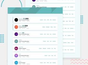
Design comparison
SolutionDesign
Solution retrospective
Any feedback would be great. Thanks!
Community feedback
- @DarwinLozadaPosted almost 4 years ago
Niceeeee! I loved your solution mannn 😁. Is very clean, the responsive desing works so well, as the filter functionality
0 - @ApplePieGiraffePosted almost 4 years ago
Hey, there, Brian H! 👋
Great job on this challenge! Your solution looks good, responds nicely, and works well! 👏
I only suggest,
- Perhaps adding a
max-widthto the job cards so that they don't grow too wide on extra-large screens. - Allowing users to close the filter tags by clicking on the entire "X" box (not just the icon inside of it) to make it a little easier to close.
Keep coding (and happy coding, too)! 😁
0 - Perhaps adding a
Please log in to post a comment
Log in with GitHubJoin our Discord community
Join thousands of Frontend Mentor community members taking the challenges, sharing resources, helping each other, and chatting about all things front-end!
Join our Discord
