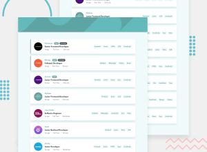
Design comparison
Solution retrospective
My first instinct was it's gonna be an easy one, but I realized it wasn't. Please i will appreciate any recommendations and feedback, thank you.
Community feedback
- @AlexKMarshallPosted about 3 years ago
This looks very good. It's responsive, the filtering function works well, and the React code is nice and readable.
There are few things worth taking a look at.
Be careful with interactive elements. If you're using
onClickthe element must be a<button>. You've currently got click handlers on spans , paragraphs and anchors. Spans and paragraphs aren't interactive elements at all. Anchors are interactive, but are only for navigation, so should never have anonClickand must have anhref. Change all of them to buttons and things will start to work with the keyboard as well.Take care with heading level semantics. You have h3's but no h2's or h1's. A page must have one single h1, and all other headings must follow in order, like a table of contents.
Marked as helpful1@ebukaezePosted about 3 years ago@AlexKMarshall thank you very much I highly appreciate your feedback, it's really helpful... I will work on it.
0
Please log in to post a comment
Log in with GitHubJoin our Discord community
Join thousands of Frontend Mentor community members taking the challenges, sharing resources, helping each other, and chatting about all things front-end!
Join our Discord
