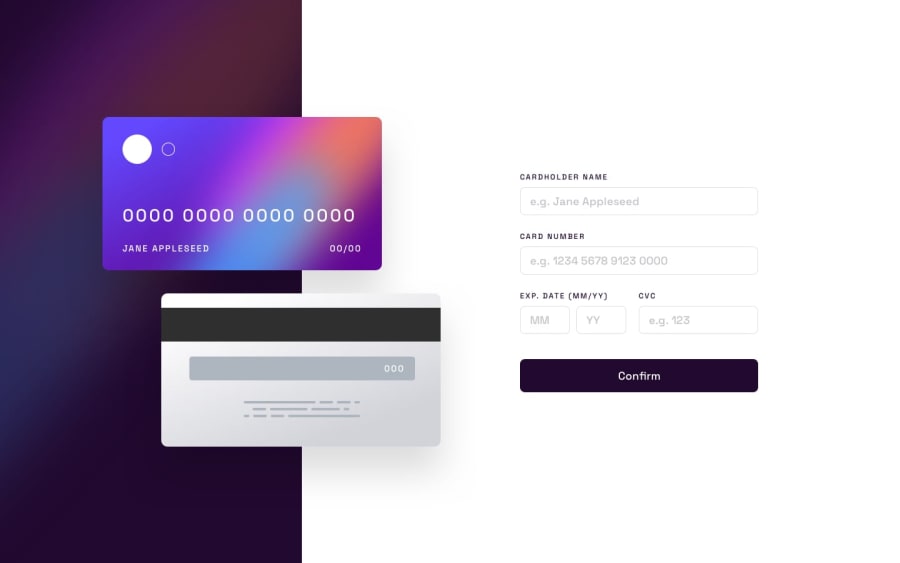
Design comparison
Solution retrospective
Technologies
- React
- HTML5
- CSS3
Project Details
The Interactive Card Details Form challenge turned out to be more challenging than anticipated, especially from a CSS perspective. I found it particularly difficult to handle the positioning of the credit cards and the accompanying information.
I'm uncertain if my approach to positioning the cards and the information was the most optimal solution. I would love to see how others have tackled this challenge and learn from their approaches. If you have any insights or suggestions regarding the CSS implementation, I'm open to feedback and eager to improve my skills.
Despite the challenges, I found this project to be a great learning experience. It pushed me to apply my CSS knowledge in a practical way and forced me to think critically about layout and positioning. I'm grateful for the opportunity to work on this project as it provided valuable insights into CSS techniques and best practices.
I have previously completed several intermediate and advanced coding problems, but this challenge posed a unique set of difficulties, particularly in terms of CSS. It served as a reminder that there is always room for growth and improvement.
Overall, I thoroughly enjoyed working on this project and gained valuable knowledge from it. It allowed me to enhance my CSS skills and expand my problem-solving abilities. I'm excited to continue learning and tackling new challenges in my coding journey.
Community feedback
Please log in to post a comment
Log in with GitHubJoin our Discord community
Join thousands of Frontend Mentor community members taking the challenges, sharing resources, helping each other, and chatting about all things front-end!
Join our Discord
