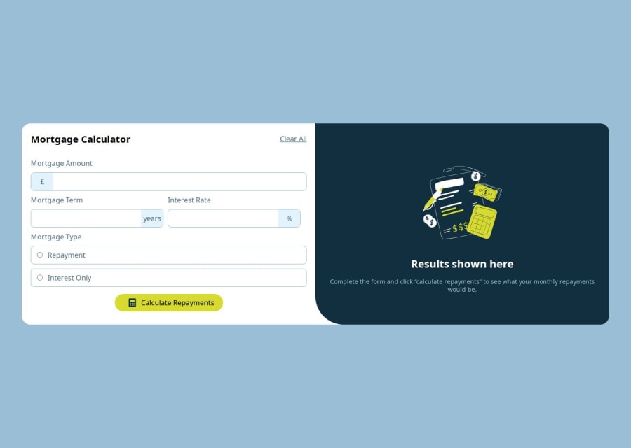


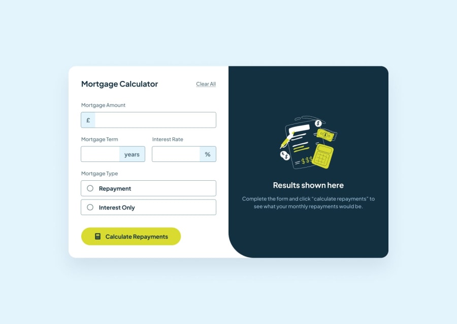
Design comparison
Solution retrospective
On MortgageTypeComponent, it is difficult to update the selected state. Finally, I can only use useState to set and modify the css variable to change the UI. On the large screen UI, the calculation content UI and the result UI cannot be evenly distributed and rendered. Finally, I wrote a maximum fixed value, which cannot adapt to all screen sizes.
Community feedback
- @khatri2002Posted 3 months ago
Hi! The solution looks great overall! Just a couple of important suggestions to make it even better:
1. Accepting Decimal Values for
Interest RateInputCurrently, the
Interest Rateinput is set totype="number", which restricts it to accepting only integers. However, it's clear that interest rates can have decimal values.-
Add the
stepattribute to the input element to specify the precision of decimal inputs. For instance:<input type="number" step="0.01" />This allows users to input decimals like
2.5,3.75, etc. -
Refer to the MDN documentation for more details.
2. Prevent Layout Shifts on State Changes
There’s a noticeable layout shift when different states (like error states or calculation results) are displayed. For example:
- The error state reduces the card's width.
- The calculation result state increases the card's width.
Why This Matters:
Such layout shifts disrupt the user experience, making the interface appear inconsistent.
- Provide a fixed
widthor amin-widthto the card to ensure it remains consistent across all states.
These changes will significantly improve both functionality and user experience. Keep up the excellent work! 🚀
0 -

Please log in to post a comment
Log in with GitHubJoin our Discord community
Join thousands of Frontend Mentor community members taking the challenges, sharing resources, helping each other, and chatting about all things front-end!
Join our Discord