Not Found
Not Found
Not Found
Not Found
Not Found
Not Found
Not Found
Not Found
Not Found
Not Found
Not Found
Not Found
Not Found
Not Found
Not Found
Not Found
Not Found
Not Found
Not Found
Not Found

Submitted

React, Framer-Motion, Macy.js, Redux Toolkit, Styled Components

Michal 665

@mbart13

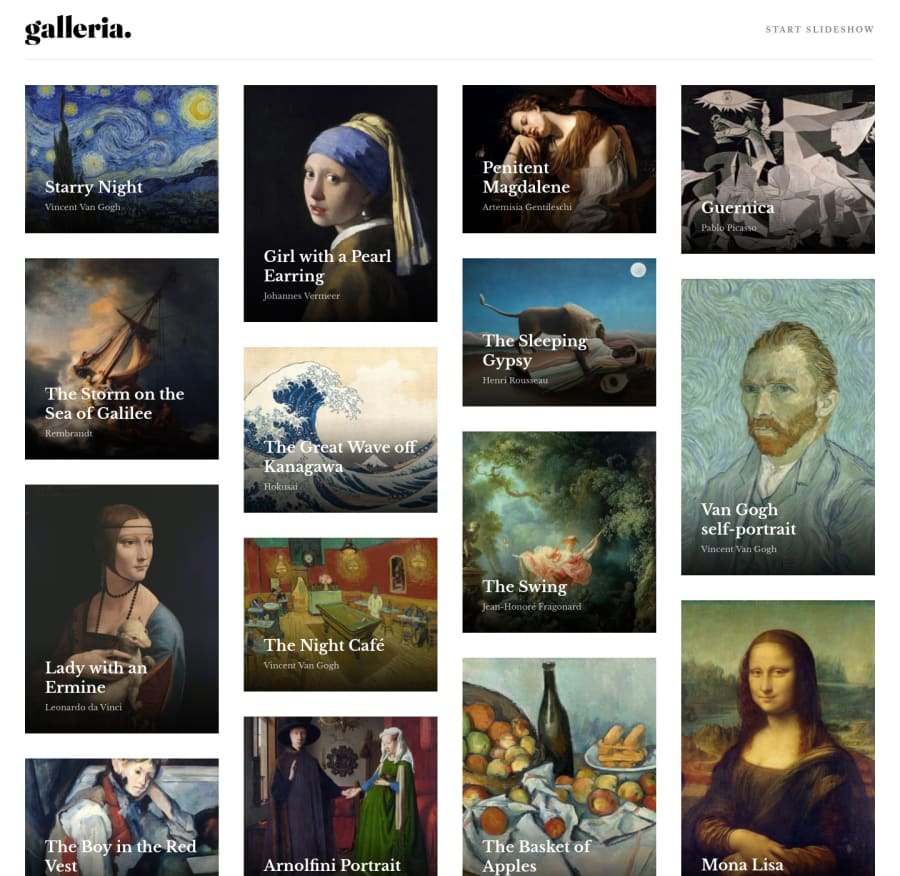
Desktop design screenshot for the Galleria slideshow site coding challenge

This is a solution for...

  • HTML
  • CSS
  • JS
3intermediate
View challenge

Design comparison


SolutionDesign

Solution retrospective


what would be the most effective way to load images on next slide?

currently, when you are running for the first time, animation doesn't go so smoothly

update: I just used Link tag with rel="preload" to preload hero images

Community feedback

P

@emestabillo

Posted

Hey Michal, looks awesome! Really admiring the animations you used here. I'm not quite getting the bug you described above, will something like exitbeforeenter make a difference? I think the layout is ready to go desktop before 1250px, or maybe having the header centered before the breakpoint just to avoid the large white space before the desktop view. For some reason, the outline around the word CLOSE is showing by default on ios. Might be specific to the OS though. Bookmarked :-)

Marked as helpful

0

Michal 665

@mbart13

Posted

Hi Em,

Sometimes when the next slide appears and image is not loaded yet, there is this unwanted effect, but I played a bit with delay and I think it's better now. Or maybe I have no idea what I'm doing anymore. I forgot about exitbeforeenter, thanks, but in this case it didn't help

Oh, believe me I tested breakpoints back and forth a thousand times, anything less than 1250px didn't look well. I followed your advice and centered upper part of slide. That would be deviating from design, but looks better. What do you think?

It was difficult to get this layout right because of absolute positioning of many elements. I don't really like doing that, but it was required to achieve sliding effect. Probably there are better ways to do that, I'm looking forward to how you, APG or Tediko will tackle that :)

1
P

@emestabillo

Posted

@mbart13 Haha them before me :-) I know you're pretty meticulous with layouts so I'm sure you likely tried a variety of solutions for tablet. I think it looks better actually. I might also play with the text below to keep it in proportion with the width of the centered image. My opinion. Project looks fab as it is!

1

Please log in to post a comment

Log in with GitHub
Discord logo

Join our Discord community

Join thousands of Frontend Mentor community members taking the challenges, sharing resources, helping each other, and chatting about all things front-end!

Join our Discord