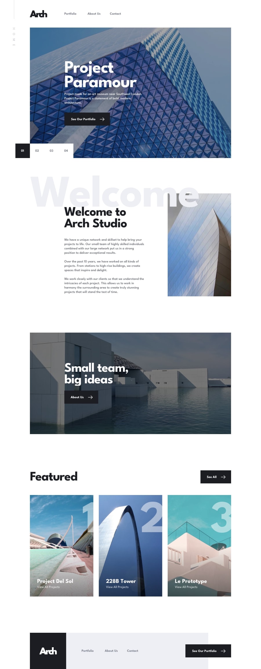
Design comparison
Solution retrospective
Went against the design slightly for the contact form. I moved the error text message below and to the left because a lot of people use LastPass and their icon sits where the message was in the design I think it is important for people to be able to still use LastPass as it should be.
I parsed out some sections of data into their own data.json file to create an easier method for building out the swiperJS, portfolio, and leader sections.
As was suggested in the brief I did use Leaflet to create the map and bespoke popups. But I wasn't able to get the flyTo method working in this version of React. So if anyone has had success getting the flyTo method to work I would appreciate some advice for that. This is why I haven't included the links that are in the design.
I did pick an new design layer for the map that I thought was more fitting for the site design and in doing so I had to update the map pins to fit.
Community feedback
- @StowCodePosted over 1 year ago
First of all, love what you did with the animations. Super cool. I had some issues with Leaflet as well, and although I didn't get the flyTo method to work, I was able to re-center the map and get a similar effect.
Changing the map view, map center, focus, and locations, were all working on the initial render, but not changing properly with state. When I revisited the docs, I disovered the children of the map container are immutable! By adding the function below, I was able to take in props and update the map properties.
const ChangeMap = ({center, zoom}) => {
    const map = useMap();
    map.setView(center, zoom, {duration: 5});
    return null;
}
0
Please log in to post a comment
Log in with GitHubJoin our Discord community
Join thousands of Frontend Mentor community members taking the challenges, sharing resources, helping each other, and chatting about all things front-end!
Join our Discord
