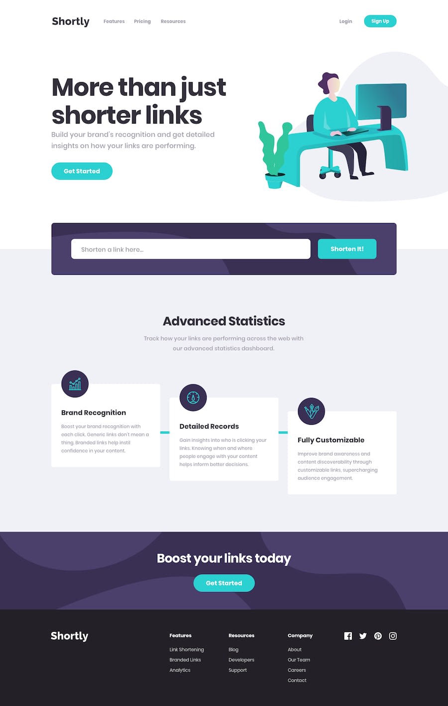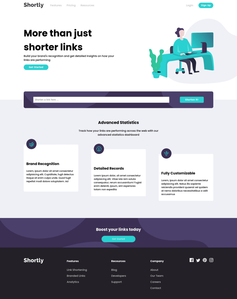
Design comparison
Solution retrospective
This app is not full interactive, I have tried to find the API to make links short but there was no guide found how to make links short. I had learnt how to manage style while working with react component but had faced new problems like in "Advanced Statistics" page I have left strap behind cards. I didn't know how to style it. Suggestions are welcome with open arms.
Community feedback
- @dwhensonPosted over 3 years ago
Hey @fahadkhanpakistan - Looking good!! 🙌 I'm also working on this challenge at the moment so was keen to see how you got on!
I haven't got to the API bit yet so I can't comment on that... and I don't know react so I can't add anything there... but one thing you might want to think about stopping the page from spreading too wide a very large screens?
There are many ways to do this but I set a grid on the body element, with three columns, as using a class selector as follows:
.center-content { display: grid; grid-template-columns: minmax(1rem, 1fr) minmax(375px, 1440px)minmax(1rem, 1fr); } .center-content > * { grid-column: 2; }
The 1440px is the max-width you want the main content to be, and the 1rem values is the smallest spacing you want either side of the main content on small screens (I sometimes put this to 0 and use a container to add padding to each section).
The second part positions all direct children of the body in this nicely sized middle column. In my case, mostly, my header, main, and footer the middle column, and stops them going wider than 1440px. It’s also pretty easy to ‘break’ elements out of this contestant if you need to.
I use this on all my FEM projects to having an approach that works for you to deal with this issue should be helpful in the long run.
Cheers 👋
Dave
Marked as helpful1@fahadkhanpakistanPosted over 3 years ago@dwhenson Thanks for sharing this, is there any way to fix it except using grid. Personally I feel easy while using FlexBox approach.
0@dwhensonPosted over 3 years ago@fahadkhanpakistan I'm sure there is. this is just my approach. You could do it with a simple container class that limits the width too. This might be a more common approach in fact.
0
Please log in to post a comment
Log in with GitHubJoin our Discord community
Join thousands of Frontend Mentor community members taking the challenges, sharing resources, helping each other, and chatting about all things front-end!
Join our Discord