Design comparison
Community feedback
- @DaFlusherPosted 11 months ago
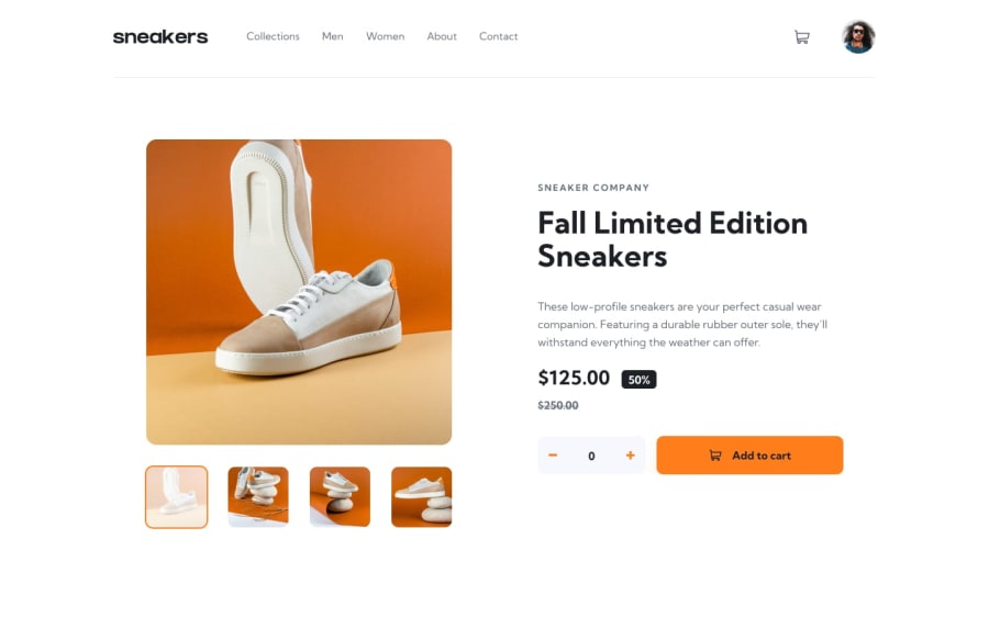
Hello Yadier! Nice job. The mobile version looks good. The web version though has the thumbnail images spilling over onto the product section, so the user cannot interact with the buttons. Maybe, you can check it out. It happens from a screen width of about 1035px. I would also suggest adding some padding to the navigation for the mobile view. Goodluck!
Marked as helpful1@Yadier01Posted 11 months ago@DaFlusher hi! thanks for the feedback. Im not able to reproduce the error, in 1035px everything look fine. What browser are you using? im using firefox.
1@Yadier01Posted 11 months ago@kcaBsIemaNeht i can now see the error, tho i think is only for Chromium base browser, ill will check it out, thanks.
0@DaFlusherPosted 11 months agoI used chrome. I just checked again and it works nicely @kcaBsIemaNeht
0 - @Yadier01Posted 11 months ago
i have no idea why it looks like that in the preview, in the page it does not look like that.
0
Please log in to post a comment
Log in with GitHubJoin our Discord community
Join thousands of Frontend Mentor community members taking the challenges, sharing resources, helping each other, and chatting about all things front-end!
Join our Discord
