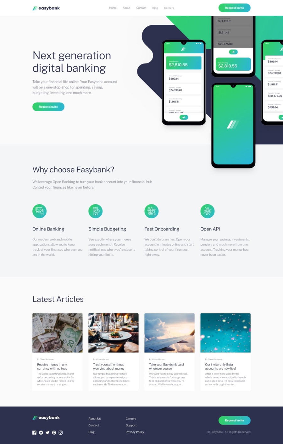
Design comparison
Community feedback
- @calebmcmainsPosted over 1 year ago
Hey! Overall well done. You did a good job paying attention to how things look at the two specified screen sizes (1440 & 375). Where that is a negative is at screen sizes beyond 1440 and in-between the two there are noticeable design issues. At your media queries it seems that you address some design issues but not all of them. Items go off center and the entire design isn't consistent across the screen. Ultimately I think some more attention to your media queries would take this to the next level. Hope this is helpful!
Marked as helpful0@amansgzPosted over 1 year agoHello! I will apply the corrections to fix the issues and finish the challenge. Thank you so much for your comments. Yes, it's really helpful!
0
Please log in to post a comment
Log in with GitHubJoin our Discord community
Join thousands of Frontend Mentor community members taking the challenges, sharing resources, helping each other, and chatting about all things front-end!
Join our Discord
