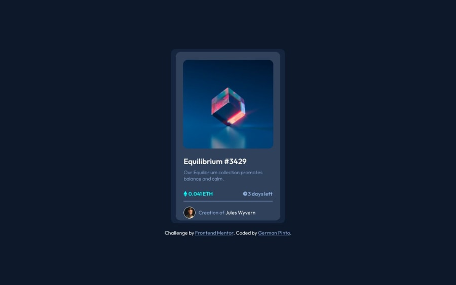
Design comparison
SolutionDesign
Community feedback
- @petritnurediniPosted 10 months ago
Congratulations on completing your project! You've done a great job creating a visually appealing and interactive card component. Here are some brief recommendations to enhance your work:
-
HTML Structure:
- Use
<main>instead of<body>within React components for better semantics. - Ensure all images have meaningful
alttext for accessibility.
- Use
-
CSS Best Practices:
- Avoid using IDs in CSS if possible for better reusability and maintainability.
- Use CSS variables for colors and fonts for easier theme management.
-
React Components:
- Consider breaking down the card into smaller components for better readability and reusability.
-
Responsiveness:
- Ensure that your design is responsive and looks good on various screen sizes.
-
Performance:
- Optimize images for faster loading times, especially for web use.
-
Accessibility:
- Ensure keyboard navigability and proper ARIA roles for interactive elements.
-
Code Cleanliness:
- Maintain consistent indentation and formatting for better readability.
-
Learning Resources:
- React Best Practices: React Documentation
- CSS Techniques: CSS Tricks
Keep up the great work and continue to challenge yourself with new projects! Your progress is impressive, and exploring new technologies and approaches will further enhance your skills.
Marked as helpful1 -
Please log in to post a comment
Log in with GitHubJoin our Discord community
Join thousands of Frontend Mentor community members taking the challenges, sharing resources, helping each other, and chatting about all things front-end!
Join our Discord
