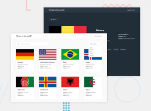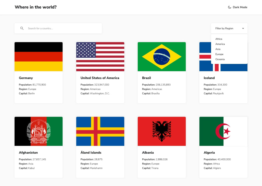
Design comparison
Community feedback
- @swagthehoomanPosted about 1 year ago
Hi @iRaYzEn, in your designs, I noticed that the filter option box doesn't change its background color based on the overall theme. Otherwise your solution is perfectly solid.
I also noticed you used the data.json file provided, which is great but try using the Api as suggested with axios or RTK Query tool. It will help you in long run.
These are my only suggestions/ feedbacks. But once again, great solution.
Happy coding!!
Marked as helpful1@iRaYzEnPosted about 1 year ago@swagthehooman thanks i will make the changes as fast as i complete my exams i am 17 btw and i have school
and for the API i am going to look at it and i may change it to the suggested api
thanks for the feedback.
0@swagthehoomanPosted about 1 year ago@iRaYzEn
You are on a great path. Continue to learn and complete more challenges.
Happy coding!!
1
Please log in to post a comment
Log in with GitHubJoin our Discord community
Join thousands of Frontend Mentor community members taking the challenges, sharing resources, helping each other, and chatting about all things front-end!
Join our Discord
