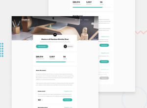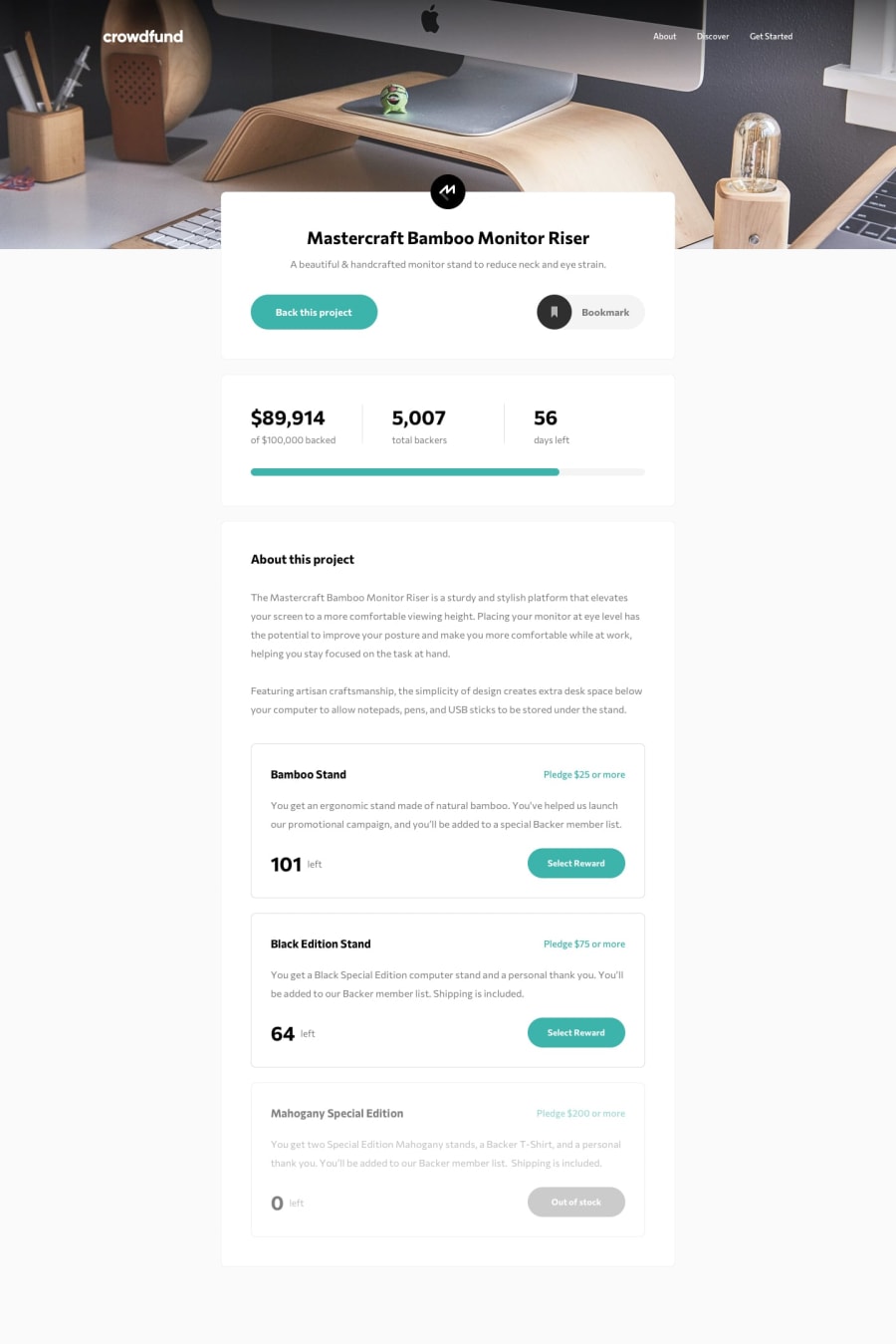
Design comparison
Solution retrospective
This was a tougher challenge than I expected!
I went for a React application to be able to break down the page into components, as well as managing the state.
The main challenge was to build an accessible modal dialog, any feedback on this part would be appreciated :)
Community feedback
- @ApplePieGiraffePosted over 3 years ago
Hey, Etienne L.! 👋
Well done on this challenge! 👍 Overall, your solution looks pretty good and works well! 🙌
One small thing I noticed, though, is that the pledge modal isn't centered on my desktop screen (it sticks to the bottom of the page, at the moment). I think centering it and increasing its height so that user will have to scroll inside it less would be a good idea. 😉
As for making the modal accessible, it currently doesn't trap focus (meaning the user can use their keyboard to navigate outside of the modal even while it is open). Here's a nice React package that will easily help you implement a focus trap for your modals (and it's actually what's used for the modals here at Frontend Mentor). 😀 But I do like how you've thought of some other things (like using
Escto exit the modal)! 👏Keep coding (and happy coding, too)! 😁
Marked as helpful2
Please log in to post a comment
Log in with GitHubJoin our Discord community
Join thousands of Frontend Mentor community members taking the challenges, sharing resources, helping each other, and chatting about all things front-end!
Join our Discord
