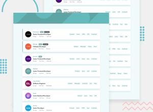
Design comparison
Community feedback
- @brodiewebdtPosted almost 3 years ago
This looks very nice. The only part of the design missing is the dark color in the header. @skyv26 said the same things I would about the accessibility issues.
Download AXE DevTools and you can clear accessibility warnings while you code. https://www.deque.com/axe/devtools/
Hope this helps.
Marked as helpful2 - @skyv26Posted almost 3 years ago
To solve accessibility issues:
-
wrap everything in your body in <main> OR give role="" to the direct children of your <body> ... Click here to read more here
-
start your headings with <h1> and move up by one level each time.
-
use alt or aria-label attributes in your img tag and keep in mind, Don't let alt attribute empty, always add some meaning text in it, so that user able to understand. Learn HERE
Good Luck ;)
Marked as helpful2 -
- @anoshaahmedPosted almost 3 years ago
To avoid accessibility issues in the future:
- wrap everything in your body in
<main>OR giverole=""to the direct children of your<body>... Click here to read more - have at least one
<h1>in your code - start your headings with
<h1>and move up by one level each time - give ur
<img>analt=""
Good job! :)
1 - wrap everything in your body in
- @DavidEmad01Posted almost 3 years ago
Nice Work
You can add an alt for images for more accessibility,
Continue Coding 3>
1
Please log in to post a comment
Log in with GitHubJoin our Discord community
Join thousands of Frontend Mentor community members taking the challenges, sharing resources, helping each other, and chatting about all things front-end!
Join our Discord
