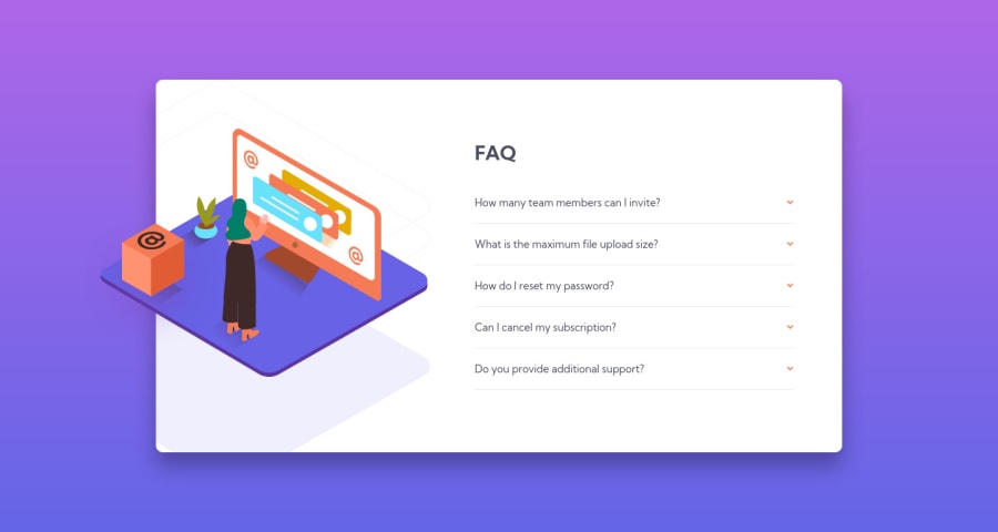
Design comparison
Solution retrospective
I got some good practice with this. I'm learning React so it was great to work with a little component, mapping out state for the questions and using an onClick method to toggle the question. Plus I got to work on things like the accordion css animation showing the answer and rotating the arrow.
The only thing that really got me was how do you hide the left side on the larger image when on desktop? I thought z-index would be involved but I could never figure it out. Thanks!
Community feedback
- @Charlie025xPosted over 3 years ago
I got the same problem. Adding " overflow: hidden;" to your container might do the trick, however the orange square becomes invisible too.
0
Please log in to post a comment
Log in with GitHubJoin our Discord community
Join thousands of Frontend Mentor community members taking the challenges, sharing resources, helping each other, and chatting about all things front-end!
Join our Discord
