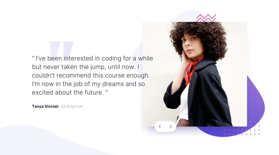
Design comparison
Solution retrospective
Hi, i had issues with positioning backgrounds and making them stay in one place and making them responsive. If you have any advice on that, that would be great.
Community feedback
- @c0dz-wqPosted over 3 years ago
I'm not sure if I understood your point. Can you simplify. How would you do it?
0 - @palgrammingPosted over 3 years ago
So you have to look at element sizes of desktop design and the layout of the desktop design and then based on the mobile layout ask if it is best to make the in-between layout with mobile layout with desktop sizes or the desktop layout with mobile sizes.
It seems if you transition first to the desktop layout with mobile element sizes and then when the view-port width increases then transition the elements to desktop size you can have a smooth transition keeping the goal of the design at all widths
0
Please log in to post a comment
Log in with GitHubJoin our Discord community
Join thousands of Frontend Mentor community members taking the challenges, sharing resources, helping each other, and chatting about all things front-end!
Join our Discord
