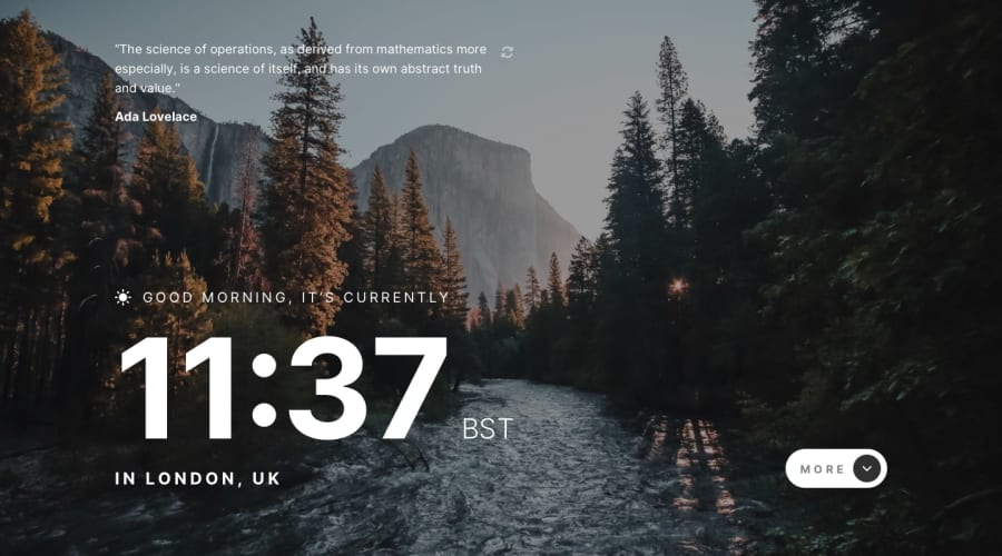
Design comparison
Community feedback
- @mattstuddertPosted almost 4 years ago
Nice work on this challenge, Jiannine! I love your choice of background images. They look amazing! 😍
One small change I'd recommend would be to remove the
h3element from inside the "More"button. Heading inside anchors and buttons lose their semantic meaning. Also, I wouldn't really consider it a heading for anything. So just having the text of "More" inside abuttonwith theimgis absolutely fine.Keep up the great work!
1@jianninetorresPosted almost 4 years ago@mattstuddert Thanks! I'll look into applying this.
0 - @ApplePieGiraffePosted almost 4 years ago
Hey, Jiannine Torres! 👋
Amazing work on this challenge! 👏
Your solution looks great and responds nicely! 👍 The transitions of the details panel and the new quote are really smooth! 🤩
Keep coding (and happy coding, too)! 😁
1@jianninetorresPosted almost 4 years agoThanks so much!
I took a peek at your work and your solutions are gorgeous :)
1 - @abhik-bPosted almost 4 years ago
Hi @jianninetorres this solution seems absolutely perfect and transitions for more section is very smooth.
However try to remove this
transform=0from this<div transform='0' class='sc-eCssSg kSsOXb'><div>to fix that html issue. Other than that good job.Keep it up 💯
1 - @jianninetorresPosted almost 4 years ago
I deliberately changed the design a bit. The background is different on mobile, tablet, and desktop. Loading dots show while the data is still being fetched.
1
Please log in to post a comment
Log in with GitHubJoin our Discord community
Join thousands of Frontend Mentor community members taking the challenges, sharing resources, helping each other, and chatting about all things front-end!
Join our Discord
