Design comparison
SolutionDesign
Solution retrospective
Hello front-end Mentor community
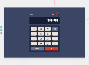
Here is my solution for calculator app with theme toggler which I built using :-
- Semantic HTML5 markup
- Css3
- MUI Grid
- ReactJS
- Material UI
For theme toggle button - I used discrete slider component of MUI for toggle button which made my work quite easy. Its not the exact comparison of what the design was but I tried to reach almost of it.
Loved completing this project and learnt lots of things
Meanwhile any suggestions or feedback for me will boost my motivation. Thankyou.
Community feedback
Please log in to post a comment
Log in with GitHubJoin our Discord community
Join thousands of Frontend Mentor community members taking the challenges, sharing resources, helping each other, and chatting about all things front-end!
Join our Discord
