


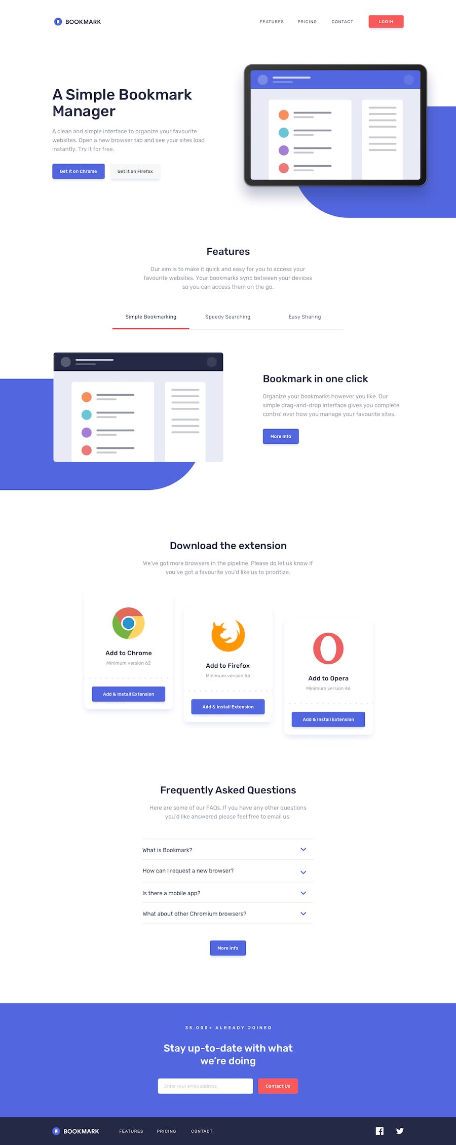
Design comparison
Solution retrospective
It's working.
What challenges did you encounter, and how did you overcome them?There were some problems when I tried to make a github page
What specific areas of your project would you like help with?I need help with mobile menu. It's kinda default and I don't have much control on customization here
Community feedback
- @edwinc73Posted 3 months ago
Hey @sergiy Nice work on this challenge. Some notes for desktop. Long lines of text usually makes it more hard to follow, you can try use a
max-width: 24rem... etc to limit this.On switching tabs I dont think the content should shift due to different image heights, you can try defining a height of its container so when the image change the container is still there and therefore the height does not change
in terms of accessibility the red and white buttons on the design doesnt actually pass contrast standards. You could try adjusting the colors but but find just changing the
color:blackFor the mobile version Some elements should be display: none, for example, the more info buttons in the features section
you could increase the padding left and right you give more white spacing around each sections. Actually in mine I tried to use a reusable wrapper called Section which held all my styles for section. This allowed me to create consistent section elements throughout the site.
For the navigation I would use react to conditionally render the side nav. this sidenav would render in 100vw and 100vh and reuse the nav items
Marked as helpful1

Please log in to post a comment
Log in with GitHub
Join our Discord community
Join thousands of Frontend Mentor community members taking the challenges, sharing resources, helping each other, and chatting about all things front-end!
Join our Discord